Posts

Showing posts from January, 2015

A Quick Guide to Color-Coding in Tabletop Games

Image
Inspired by this week's #BoardGameHour discussion of disabilities and access to tabletop games, I made this quick guide to color-coding. Boy howdy, did this blow up on Twitter. It's by far my most RTed and faved tweet. Below is the text from the image. Quick Guide to Color-Coding in Tabletop Games Color perception problems can happen to anybody. Whether caused by poor lighting, printing errors, or an eye condition, there is a very simple solution any graphic designer can use. Instead of using colors alone... [Image: Line of Colored Circles] “Double-code” with a correlated visual cue, like an embedded icon... [Image: Line of Colored Circles, each with a different black shape centered inside.] and unique card border or background. [Image: Line of sample card borders, each with varying corners and line quality] Uniquely textured, screenprinted, or shaped components can help, too. Group each color with one or two other visual cues that are high contrast, easy to see in low li

Light Rail: Downtown now available!

Image
All aboard! The first expansion for Light Rail is now available! Light Rail: Downtown adds enough cards for two players to play out a full four-player city. New cards have three different buildings, making them more valuable for building routes.  The Express lines count as double-segments to quickly build a majority claim to routes, but have no terminals so play them carefully! So go get Light Rail: Downtown ! Don't forget, this is an expansion that requires Light Rail to play. Pick that up, too!

Protosprinting: Stepping back to move forward

A long time ago I talked about how I approached rapid prototyping during the development of Belle of the Ball. It's been about two years and a dozen games since then, so I've revised that process a bit. Last year taught me how much going at full-throttle design can lead you down the wrong path. These digressions happen in every design process, but I sometimes went further down those wrong paths than if I had stopped and considered my current trajectory. For A La Kart, I'm trying something I'll call protosprinting . Playtest Day: GO GO GO! On playtest day, I'll revisit my notes from my last playtests. I'll anticipate problems, hopefully optimize solutions, and rapidly iterate new prototypes with minimum necessary graphics and layout. When the playtest comes around, I take feedback, write notes, and test on-the-fly handwritten edits when feasible. Every Other Day: Rest After that burst of output, I'll give myself 1.5 times as many days away from t

#NewBoardGameTheme

For a few months, I've been tweeting some quick premises for board games under the #NewBoardGameTheme hashtag. I didn't really have a core agenda for the tag except that I just wanted to bring up some themes with under-explored player interaction, non-eurocentric historical themes, and no presumption of violence as a means to solve problems. Whoops! I guess that is an agenda after all. ¯\_(ツ)_/¯ For posterity, here are the pitches as of January 20, 2014: Asymmetric strategy game about taking down the tobacco industry from 1950 to 2000. #NewBoardGameTheme — Daniel Solis (@DanielSolis) October 30, 2014 Intervention: Use Pandemic's outbreak mechanism as a model for addiction relapse and recovery. #NewBoardGameTheme — Daniel Solis (@DanielSolis) October 30, 2014 Co-op game about the Civil Rights movement. Each player has competing methods/philosophies. #NewBoardGameTheme — Daniel Solis (@DanielSolis) October 30, 2014 Laying the fiber infrastructure of

Graphic Design Seminar at UnPub 5

Image
Next month in Baltimore, I'll be attending UnPub 5 and running a short seminar covering the basics of graphic design in tabletop games. Thing is, I always find it more productive if I can actually know what it is that attendees want to know. So, if you are attending UnPub 5, please share your questions! Here's my general outline: Introduction Experience in Advertising/Marketing Experience in the Tabletop Industry Typical process for a graphic designer for tabletop games I. Graphic Design for Players Typography Hierarchy: How to organize sections of text. Legibility: Making sure text is readable. Iconography What is an icon vs. a diagram? When is it best to use either? Color What are the "safe" colors for color-blind players? Common Resources Fonts: Blambot, Lost Type Icons: Noun Project, Game-Icons.net, my Patreon Inspiration: Lovely Package, Web Design Ledger Stock: Shutterstock, Creative Commons Misc: InDesign Secrets, PSDCover

Ducks in a Row: Apples-to-Apples Mechanics as a Strategic Trading Game

Image
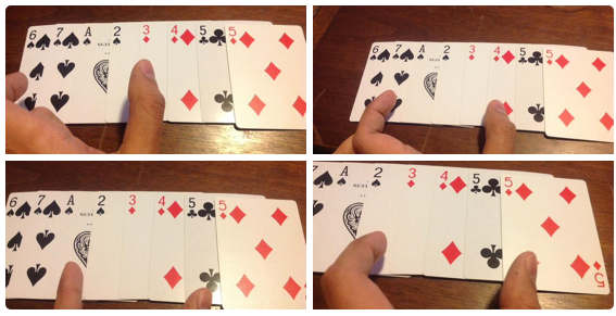
It's been a while since I've posted a simple little game here, so try this one out and share your thoughts. Take a standard deck of cards and shuffle them up for a group of 3-6 players. Deal out a hand of nine cards to each player and set aside the remainder. Choose someone at random to be the Judge for the first round. HOW TO PLAY To play, each player (including the Judge!) simultaneously chooses one card to offer the other players, face-down. The Judge keeps her card face down to the side of the play area. The Judge mixes up everyone else's offered cards while they're face-down so she can't tell who offered which card. Then the Judge reveals the offers to all players. The Judge selects one card from the offer, adding it to her personal scoring tableau. The player who offered that card to her then takes one card from the offer, adding that to his own scoring tableau. The player who offered that card, then takes her choice of card... and so on, so each pla

Now on SkillShare! Graphic Design for Collectible Card Games

Image
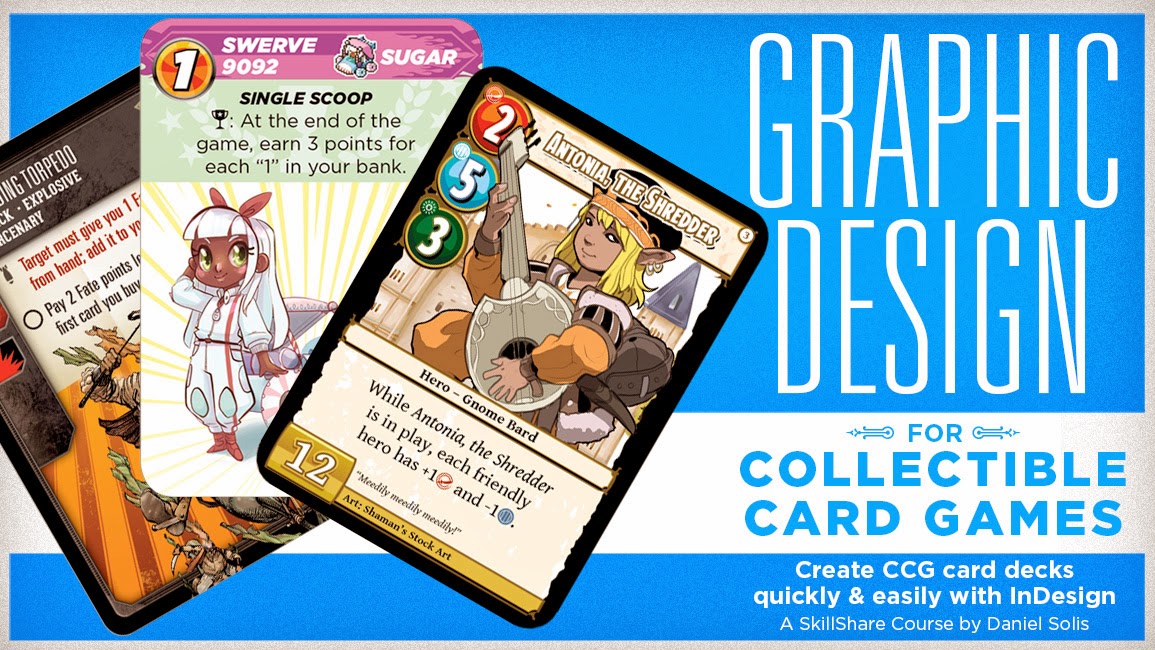
Ever wanted to design your own deck of cards but were intimidated about all the fiddly bits of graphic design? Check out my latest SkillShare course Graphic Design for Collectible Card Games , a set of video lessons where I take you step by step through my design process for card decks. This is a followup to my previous SkillShare course Designing Cards for Tabletop Games , so it might help to check that out first. Collectible card games are really fun, but they can be intimidating as a graphic design project. All those stats and variable elements! I'll de-mystify the advanced features of InDesign's DataMerge so you can easily create a deck of cards and rapidly iterate during your development process. At the end of this course, you will know how to Create dynamic card frames that adapt to text length Design your "dingbat" icon font and automatically insert icons into text Get the most out of art assets with transparent backgrounds And more! So c

Spirits of the Rice Paddy on Kickstarter

Image
Happy to announce that Philip duBarry's Spirits of the Rice Paddy is now on Kickstarter. I did graphic design for this project back in mid-2014, designing the cards, components, player boards, iconography, the whole shebang. It's my heaviest Euro design job and involved a lot of tweaks from several rounds of playtesting. The game puts players in the role of rice farmers guiding the flow of water through their fields and occasionally getting assistance (or hindrance) by spirits. Players draft spirit cards which are individually numbered, always making you choose whether to get first dibs on precious water or earn favors from the spirits. It's a classic Euro that scales well from 2-4 players and moves along at a very nice pace. Go check it out on Kickstarter!

Promoted Tweet Strategy for Tabletop Games

Image
The old saying goes: You're always wasting half your marketing budget, you just never can tell which half. I examined my in-depth analytics about my 2014 sales so I could launch a reasonably geo-targeted twitter campaign promoting the right games in my catalog. For example, despite large populations, I wasn't selling much in Texas or Florida. Those are territories I can aim for at a later date, after more firmly establishing an audience in strongly burgeoning markets like California, Washington state, and right here in North Carolina. I also set my campaign to run in Japan, since I've heard some buzz about my games there. I launched my first campaign with a very softly worded opener: Think and smile with new strategy card games for all ages! https://t.co/tUA8OnUxdU pic.twitter.com/ruciSlKvsY — Smart Play Games (@SmartPlayGames) January 1, 2015 The results of that first week were about 25,000 impressions, with 14,000 from Japan alone. Looking at my 2014 sal

Sprites for A La Kart

Image
Just another little peek at the art I've commissioned for A La Kart. These sprites come from Fabio Fontes , whose pixel art you may recognize from Pixel Tactics. ( Now on kickstarter! ) I usually do not recommend getting art too early in game development, but in my case it helps to keep my design direction clearer. In this case I'm reminding myself to keep true to the Mario Kart inspiration: Approachable premise Simple mechanisms with fast interactions Variable terrain tactics Frequent opportunity for little victories  That's the goal! So far so good.

Smart Play Games 2014 Sales by Product

Image
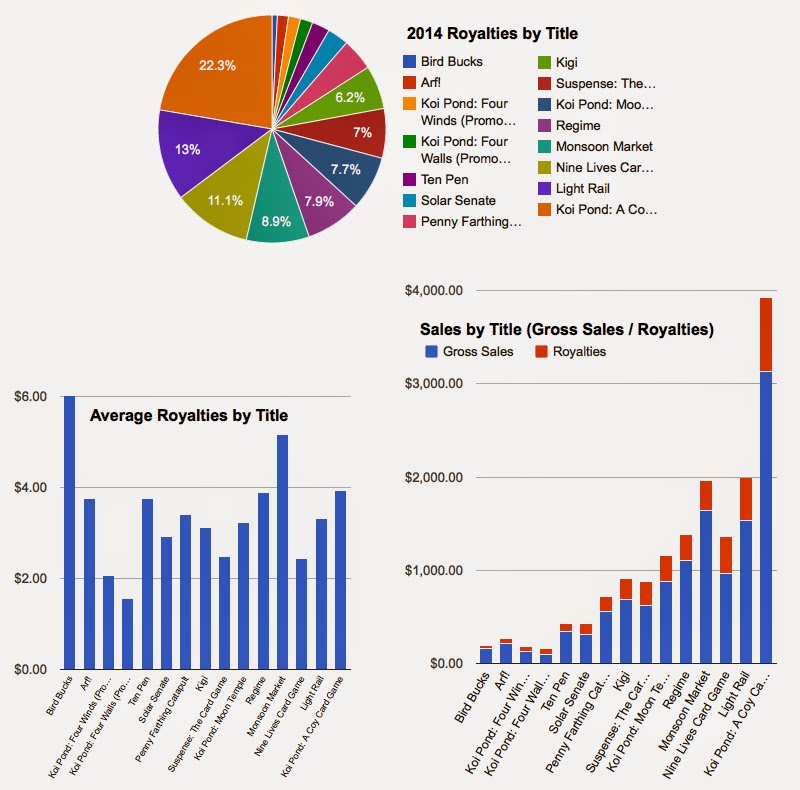
Not done crunching the numbers yet! Sorry if this is boring folks who want to see more graphic design and game stuff, but I wanted to see how each title performed through this year. I whipped up these three charts to see how they performed. (No awards for infographic design here, sadly.) Measuring success by product is tricky because I released new product each month of the year, so naturally the longer-lived products would have higher total sales than the younger products. On top of that, the prices of each product varied through the year depending on promotions or discounts. I've just averaged things out where they vary a lot. Despite all that obscurity, it's useful to see individual product earnings on their own terms. Take a look at the interactive charts below for details. Not a lot of surprises here. Koi Pond is the top seller by far, and a good earner in terms of royalties. Nine Lives is a bit low, considering the pie chart below. Otherwise Light Rail and Mons