Posts

Showing posts from 2023

2023 Book Review

Image
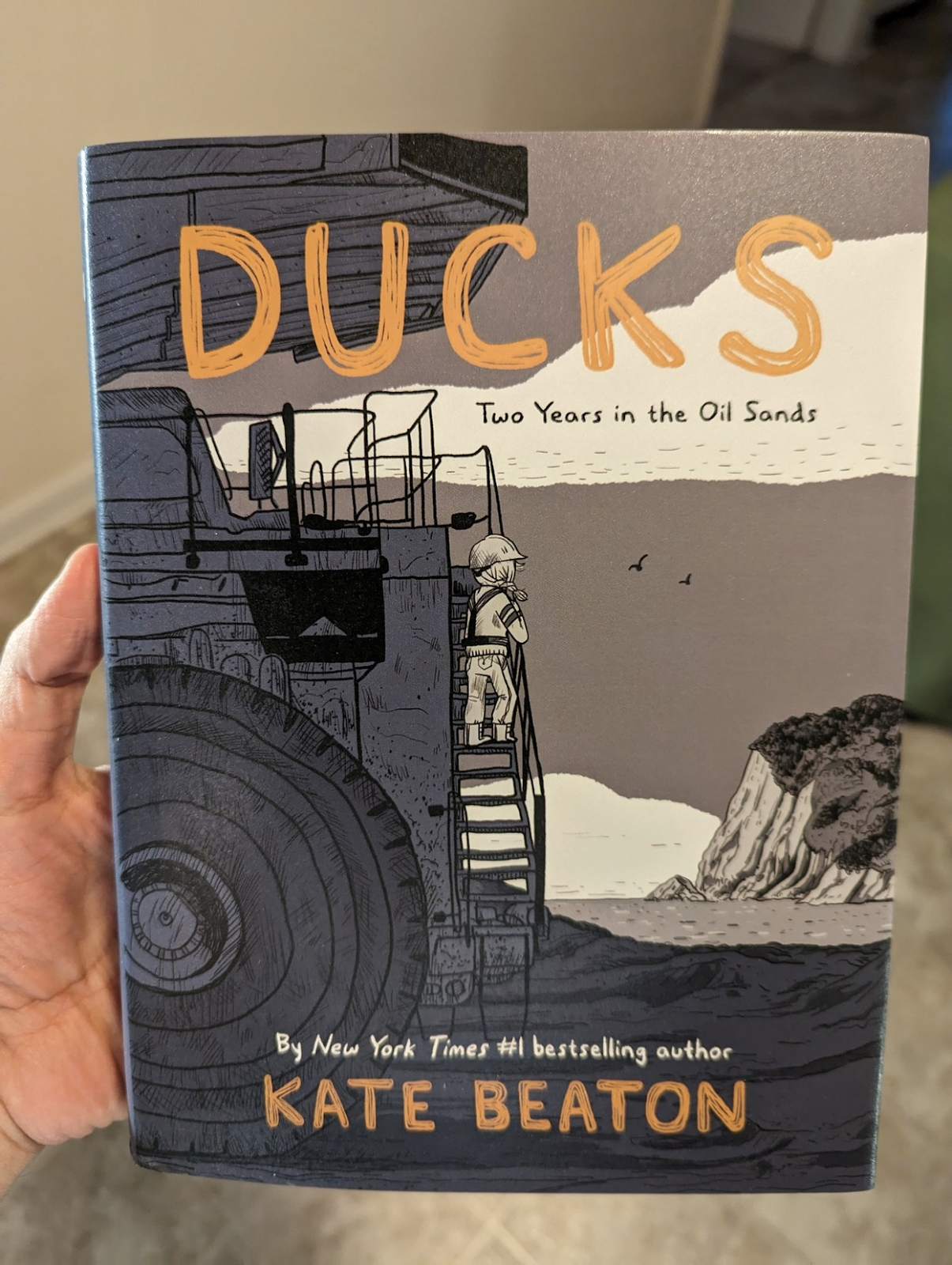
Here are all the books I've read and reviewed over the past year. As is typical of my lifestyle, I take in more audiobooks than physical books. I'm not a purist about that sort of thing. The one hitch is that I've already burned through a LOT of the audiobooks from the library that had my interest. It's forced me to branch out to other genres, so you'll see some more non-fiction and a couple of mysteries here. Plus one or two books I'm categorizing as Fantasy, though there are no swords and sorcery in the mix. There is one very specific element that kept popping up in the sci-fi I read this year: A distant-future community of humans has their Earthly origins kept secret by a manufactured religious authority. The Interdependency Trilogy features a theocratic government put in place to manage an interplanetary alliance of traders and producers. The Safehold series backstory, human survivors of an alien purge get their minds erased and rewritten to avoid any new in

Five Themes for Set Collection in Board Game Design

Image
I often rely on set collection for my early prototypes. It's such a simple, satisfying framework to motivate players and give clear goals. The problem is how often set collection becomes a rote, emotionless task list to complete. The theme of the set collection is what set makes it more appealing to new players. An evocative theme suggests secondary mechanisms that help fill out the rest of the game. Here are a few themes I've used or seen over the years. Recipes and Shopping Lists Welcome to Stabbed! Impress the chefs, follow the recipes, and you won't be stabbed! This is by far the most common usage of set collection. Players are tasked with collecting certain amounts or combinations of resources. Then they're rewarded with a certain number of points. That straightforward transactional structure is certainly useful when the rest of the game is rather complex, but it doesn't necessarily suggest fun secondary mechanisms. I got around this in Junk Orbit by making th

Artist Advice: Early in my career, should I focus on building my portfolio or taking on small jobs?

Image
  This is extremely important: What you draw today is what you'll be hired for tomorrow. If you draw spaceships, you'll show up on searches for spaceships. If you draw dragons, you'll be sorted with the dragons. If you don't want to draw spaceships or dragons, don't post them in your portfolio. As an art director, I have to search through hundreds of portfolios for each project, looking for the right potential candidates. If I don't see what I need in your portfolio, you don't even appear in that initial search, let alone get further consideration.  If you're in a financial position to just work on your portfolio so you can build up your skills, that's totally valid. Just make sure you're posting consistently and that your best work is visible first. You can also delete older work that doesn't show your current skill level. (I see a lot of portfolios with years-old freshman-level work that never got cleared out.) To get paid will building you

Artist Advice: How do I pick freelance jobs early in my career? Should I argue for higher pay or take what I can get?

Image
First of all, never work (for someone else) for free! I'll break those four ideas down below, but just remember that only you can determine what your time is worth. You can always go lower, but it's hard to go higher. I recommend starting high. Never accept the feeling of being underpaid for your time and skill. You'll be surprised how quickly you can fall out of love with art. That said, both of these questions require an honest assessment of your skills, availability, the client's personality, and your enthusiasm in a particular project. Skills : Browse "open for commissions" tags on social media and look for artists with a similar style and skill level as yourself.  Try  to do this with a healthy perspective. This isn't an attempt to make yourself feel bad or good. Think of it as co-workers organizing for better pay. You're just assessing a fair pay rate. Even if all other skills are equal, you might still opt to charge more for the same project tha

7 and 1: Avoiding Confusion

Image
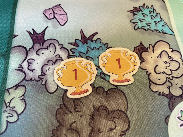
  Photo of two tokens. One with a one and one with a seven but they look almost identical making it hard to differentiate. ( Source ) Some typefaces don’t have enough distinguishing features between their 7 and 1. The usual culprits are sans serif, modernist, or futuristic fonts that have removed so many distinctive features of their characters that they become indiscernible from each other. You may also run into this problem with italicized numerals, where a slanted 1 could be confused for the angle of a 7. 7 should have an exaggerated angle, with a wide stance that significantly extends its top bar. It may also be handy to have a small crossbar across the midsection, though this is not a common attribute. Avoid any 7s that have a serif base, since that is more common for a 1 and may lead to further ambiguity. 1 is should be upright, to contrast the 7's lean. You can look for an even MORE simplified 1 that is so abstract that it just becomes a skinny vertical line. Just be careful

"Snappy Dresser" Card Template

Image
As a little weekend hobby project, I was thinking about how some of the concepts and visual language of Marvel SNAP would translate into a printed card.  Very quickly, this spun out into its own concept. I imagined the cost and strength would both have to be locked to the top left for ease of reference. I minimized the cost icon to be less prominent since you'd rarely have to look at it while it's in play. The basic, ongoing, and reveal abilities ought to have distinct backgrounds so you could quickly scan the board for triggers.  The artwork here comes from "Aguila Negra" (Black Eagle) issue #100, a Portuguese language comic from 1966 that is now in public domain. I loved that this guy wearing a full knight costume would don a disguise OVER his costume, including sunglasses over his mask and a fedora over his helmet! Quite a snappy dresser indeed! You can download this Photoshop file at the Patreon post linked below.  » https://www.patreon.com/posts/82651355 This inc

Troubleshooting: How to fix "Remove Blank Lines for Empty Fields" in InDesign Data Merge

Image
I'm working on a card design that has multiple variables within the same text field. Each variable is its own paragraph with its own Paragraph Style. It's rare that every card has content for each variable ABC though. Usually it's a mix, like AC, AB, or BC. The issue is that when you delete empty lines, sometimes the remaining paragraph gets re-assigned the deleted paragraph's style. Compound this over a whole document and you can see why it's a pain in the butt. Here's a video explaining the situation: Here's my solution: To reliably remove blank lines from a merged document, first do NOT activate "Remove Blank Lines for Empty Fields" in your Content Placement Options. It's often too buggy to be reliable, except in the most simple cases where all of the paragraphs have the same style anyway. Then Create Merged Document as you normally would. The resulting document will have a lot of blank lines because of the empty fields. Here's what you

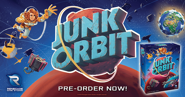
Junk Orbit is back! In box form!

Image
Howdy folks! Big news announced yesterday from Renegade! There will be a new edition coming with new content, some rebalanced ship powers, bigger ship meeples, and all in a proper box! From the publisher: https://renegadegamestudios.com/junk-orbit/ New Features! New box! Now in a standard box with a fitted plastic tray for tile storage! Solo mode included! 2 mini expansions included! The Mission Control promo pack with new ship cards and player powers and Tours Mini-Expansion with new Tourist cards and ways to score!

"Tolstoy" by Sid Sackson (Excerpt from "Beyond Words")

Image
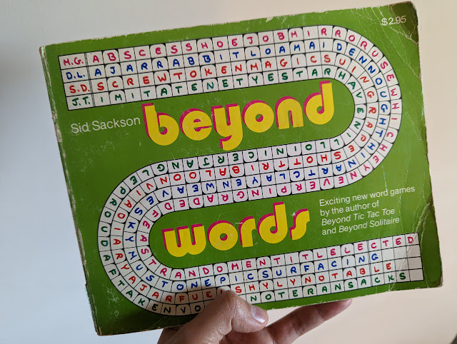
Cleaning out some old office furniture, I stumbled across a cache of vintage game books I purchased from Dickson Street Books  many years ago. Among the collection is this well-loved 1977 edition of Beyond Words by Sid Sackson, the legendary designer of Acquire and Can't Stop.  This was the third in his series of "Beyond" game books, the first two being Beyond Tic Tac Toe and Beyond Solitaire . This book contains six word- and letter-based games named in honor of famous writers. The book presents short rules for each game, followed by perforated sheets that you were meant to pull out and play on with pencil or pen. Kind of a crossword or word jumble book you'd find in a supermarket checkout. The first of these games is titled "Tolstoy," which I share below.  First, some historical notes if you've never read rules by Sackson. I've often considered Sackson's designs years ahead of his time, yet I still get tripped up by how he writes his rules. I

New HeroClix card format!

Image
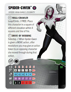
The new #HeroClix card format is now public! The main goal was to bring more attention to the sculpt, not having it cropped to a little bust on the corner. That dominoed into a few other measures to conserve space, compress reference information, and generally make the game easier to approach. I learned a lot! While I'm happy with this first wave, the future waves look even better now that the template is stabilized and future-proofed. See official release for details: https://wizkids.com/heroclix/2023/01/30/breaking-new-ground-heroclix-2023-rules-4-comprehensive-rules-and-miscellaneous-changes/ 

Label Punchboard Sheets in Board Games

Image
I'm trying to make it standard that punchboard sheets label the components in the negative space between die cuts. My hope is that this helps the customer during the unboxing process as they're sorting out their bits. I know it might seem redundant if they're also looking at the rulebook as an inventory list, but I'm always trying to find ways to improve the customer experience. Sometimes that means an extra affordance that 99% of customers won't notice, but that 1% who feel served will be very vocal about their satisfaction. What would you like to see added to punchboard sheets in board games? For more tips and tricks, please sub to my patreon at patreon.com/danielsolis. 

Making a Better Drop Shadow

Image
  New video! Here's a simple trick I've used for years to make a better drop shadow than the default shadow you get from layer effects. Hope you find it useful!

Components and Setup in Rulebooks [Video]

Image
Here are the two basic methods we've used for laying out diagrams in Components and Setup sections of our board game rulebooks. There are slight variations between these two extremes depending on the game, but generally they start with either of these two options. Combined This is one diagram showing a complete game setup. I use numbered tags to that correspond to each step of setup and lettered tags that indicate each game component. Components and Setup from Atlantic Robot League Pros: Saves space. Great for small games or small books. Cons: Can be crowded. Difficult to see the smallest components. Doesn't easily account for optional modules or variable setups. Separate This is a more traditional option you'll see in most rulebooks. There's one "contents" or "components" section, usually a full page or a spread. The components will be neatly organized into a clean grid and individually labelled for ease of reference. The components are not at accur

Oort/Pizza Coven, a spatial auction game [Games that Got Away]

Image
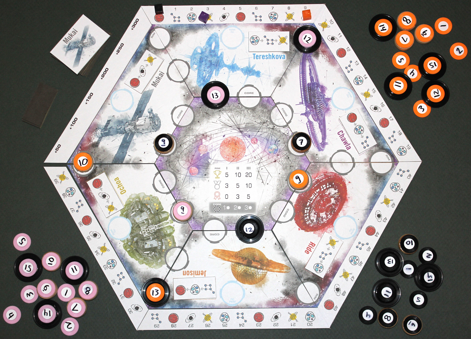
This is the story of how I tried to make a cool spatial auction mechanism into a complete game, but never quite found a concept that sold to a publisher. The last version was called OORT and the details are here: Theme Pitch: The Oort cloud is the last stop for a thousand light-years, so you better stock up! Dock your ships at the right stations to claim the best supplies and send their whole fleet further into space. Gamer Pitch: This is an auction in which where you place your bid matters. A top bid only lasts once, but a lesser bid can persist for multiple rounds. ( Rules Google Doc Here ) What Worked: Top bidder wins, but doesn't stay. Players have "ship" discs valued at 1 to 15. Each round, a random segment of the board is being auctioned. Bids are placed in turns, face-down. Though the bids are hidden, you do know some information: Small ships are valued 0-4. Medium ships are 5-9. Large ships are 10-15.   You must place bids at specific spots around that segment.