Components and Setup in Rulebooks [Video]
Combined
This is one diagram showing a complete game setup. I use numbered tags to that correspond to each step of setup and lettered tags that indicate each game component.
- Pros: Saves space. Great for small games or small books.
- Cons: Can be crowded. Difficult to see the smallest components. Doesn't easily account for optional modules or variable setups.
Separate
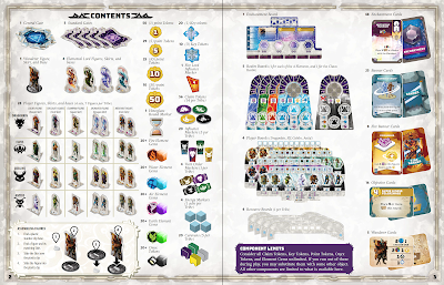
This is a more traditional option you'll see in most rulebooks. There's one "contents" or "components" section, usually a full page or a spread. The components will be neatly organized into a clean grid and individually labelled for ease of reference. The components are not at accurate scale, they're sized for optimal readability on the page.
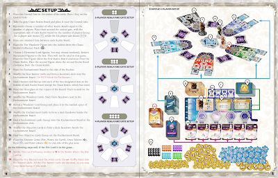
Then on the next page or spread, you'll see the full game setup with all components at their correct scale to each other. Usually there will be an inset or sidebar mentioning variable setup based on player count or difficulty level. Because there are fewer tags floating around, there's usually more room for arrows to indicate how cards are dealt to different locations or components divided amongst other players.
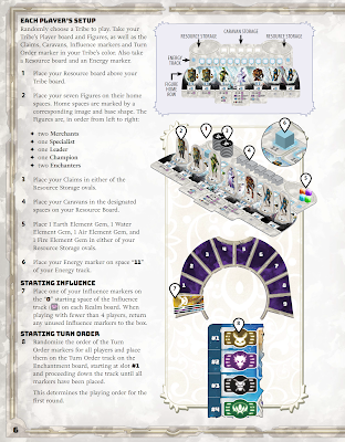
This option also gives you the advantage of making a separate page focusing just on an individual player's personal setup after the general setup is complete, as shown below.
 |
| Personal Setup section from Gates of Mara |
- Pros: Easier to parse individual steps. Easier to take an inventory of all game components. Generally more generous with text sizes and readability.
- Cons: Makes the rulebook bigger. May make setup seem more daunting than it actually is.
As you can see, both are valid for their use-cases. Neither is inherently better than the other. Do you have some good examples from rulebooks you liked? Please share in the comments!


Comments
Post a Comment