Posts

Showing posts with the label art

Artist Advice: Early in my career, should I focus on building my portfolio or taking on small jobs?

Image
  This is extremely important: What you draw today is what you'll be hired for tomorrow. If you draw spaceships, you'll show up on searches for spaceships. If you draw dragons, you'll be sorted with the dragons. If you don't want to draw spaceships or dragons, don't post them in your portfolio. As an art director, I have to search through hundreds of portfolios for each project, looking for the right potential candidates. If I don't see what I need in your portfolio, you don't even appear in that initial search, let alone get further consideration.  If you're in a financial position to just work on your portfolio so you can build up your skills, that's totally valid. Just make sure you're posting consistently and that your best work is visible first. You can also delete older work that doesn't show your current skill level. (I see a lot of portfolios with years-old freshman-level work that never got cleared out.) To get paid will building you...

Artist Advice: How do I pick freelance jobs early in my career? Should I argue for higher pay or take what I can get?

Image
First of all, never work (for someone else) for free! I'll break those four ideas down below, but just remember that only you can determine what your time is worth. You can always go lower, but it's hard to go higher. I recommend starting high. Never accept the feeling of being underpaid for your time and skill. You'll be surprised how quickly you can fall out of love with art. That said, both of these questions require an honest assessment of your skills, availability, the client's personality, and your enthusiasm in a particular project. Skills : Browse "open for commissions" tags on social media and look for artists with a similar style and skill level as yourself.  Try  to do this with a healthy perspective. This isn't an attempt to make yourself feel bad or good. Think of it as co-workers organizing for better pay. You're just assessing a fair pay rate. Even if all other skills are equal, you might still opt to charge more for the same project tha...

In Praise of Marvel SNAP's character logos

Image
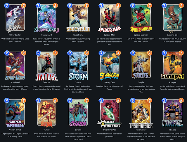
  Like everyone else late last year, I got pretty hooked on Marvel SNAP. But enough ink has been spent praising the elegant gameplay, clever wagering strategies, and rather generous business model. I'd instead like to highlight the logos! The little names you see on every card in the game. Having worked on several Marvel card games in the past two years, I've certainly considered giving every card their own masthead name like this, but the challenge is always three things: Not every character has an iconic masthead to pop onto the card. Some characters have just not headlined their own comic series, so there's no precedent for their logo. We have limited graphic design resources that need to be spent on boards, rulebooks, tokens, packaging, marketing, and web. There's just not room in the pipeline to make a whole new brand logo for each character. Even if we had the bandwidth to do it, space on our components is so limited that a big masthead would cut into valuable rea...

Estimates for Art Costs (2022/2023)

Image
Planning an art budget for your board game? Here are average estimates I'm seeing lately, as of the end of 2022. But first, a caveat: Quotes vary by many factors, including but not limited to the following: Dimensions: The bigger the art, the more expensive it is. Medium: Traditional paints and inks cost more than digital. Style: The more you make an artist work outside their expertise, the more it will cost. Complexity: A shot of a superhero flying in the open air is cheaper than the full super-team defending a city.  Color/Ink: Some artists will cut you a deal if you only need linework. Terms & rights: If you want full work-for-hire rights to the art, expect to pay for it. Size of cast: Each character multiplies the complexity of the scene. If you want a big battle, it'll cost more depending on how many participants there are. Detail: Photorealists charge more than cartoonists, typically. That's not always the case though. Timeline: The sooner you need it, the more ex...

Art Tip: Secondary Outlines to Prevent Tangents

Image
Art Director tip: You can prevent tangent lines by adding a lighter secondary stroke around the foreground characters. (Example: Action Comics 1034, Christian Duce.)  Without this outline, the panels would directly intersect Superman directly, which may muddle the perspective. Most often, I see this technique with a light stroke alone, without an extra black line as Duce has demonstrated here. Either is fine, depending on the job. Image Description: Close up of Superman. His pose breaks through his panel and overlaps a bunch of other panels. A light outline around his body prevents the lines of those panels from intersecting him directly.

SPX 2016 Overview

Image
Howdy folks! I just got back from SPX 2016, the convention focused on independent and small press comics creators. Back in 2014 I briefly mentioned SPX as a great source for artistic talent. Last year I described the parallels between the indie comics and the tabletop game design communities . This year I'm just exhausted, so here's a link to the pinterest board of artists I met at the hall . Most of these artists said they were available for freelance assignments, so if you're a publisher or art director looking for new talent, check them out! A brief overview of my exp at the show: Fri: Toured the comics vault at Library of Congress. Saw a lovely Harrison Cady piece. Talked sci-fi movies with new friends. Then hauled boxes around the hall for set up. Sat: Line mgmt duty. Met The Adventure Zine artists. Saw the Ignatz Awards. Danced at (and evacuated from) the SPX prom. Sun: Mostly special duty. Saw @careydraws on Magical Girls panel! Then teardown, lifting, h...

Making Art Direction More Inclusive

Image
When I get the wonderful opportunity to art direct for new characters, it's like opening a big awesome toy box. I have to remind myself of some things so I approach this job responsibly. This isn't necessarily a "tips" list, or in any order of priority, it's just what I try to keep in mind. Hopefully it's something you might find useful, too. An inclusive mindset is a crank, not a switch . It isn't a one-time flip from ignorance to enlightenment. It's an ongoing process of checking self, looking back on mistakes, and making assertive efforts to do better. I've never been and never will be 100% " woke ," but I must keep trying to "wake up." I will make (and have made) mistakes, but that isn't an excuse to stop putting in the effort to be more inclusive. This has real practical impact when I'm working on a project as an art director. As an art director, I have so much freedom to guide artists in certain directions ...

Preview Molly Ostertag's Art for "Curse You, Robin Hood!"

Image
Molly Ostertag illustrated "Curse You, Robin Hood!" omg! OMG! I'm so happy with how these five characters turned out. She provided the line art and I did my best to add a few pops of color that wouldn't get in the way of her awesome work. Below is a time-lapse video of the coloring process. And check out how it turned out below:

Preview of Dionysia Jones' Art for Do: Fate of the Flying Temple

Image
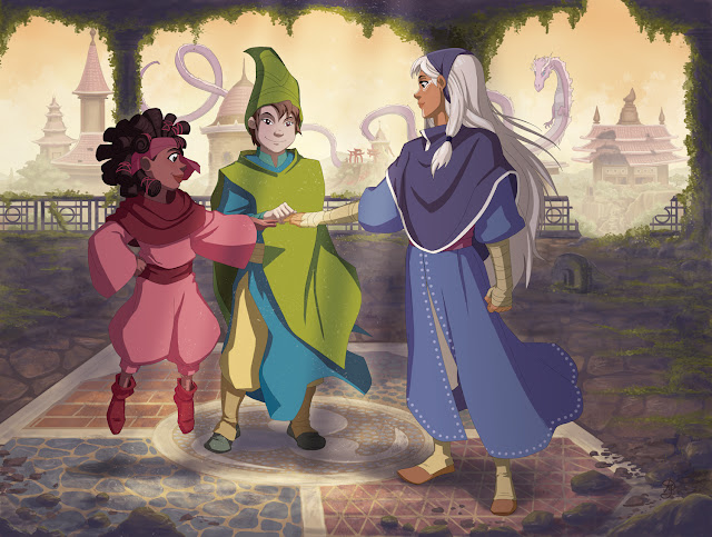
It's time for another preview of the art coming up in Do: Fate of the Flying Temple, the new Fate-powered RPG set in the Do universe. Y ou saw Jacqui Davis' cover last time , so this time I wanted to show off Dionysia Jones' amazing work on the double-page spreads. Here was my art direction: The three pilgrims gather in the middle of ancient ruins to discuss what they will do now that the temple has disappeared. They agree that their mission of helping people in need should continue, regardless of the temple’s existence. It’s just the right thing to do. They agree to this new pledge with an all-together handshake as shown in the placeholder art. [1] In the distance, amidst the ruins, we might see the silhouette of the dragon observing this pledge intently. The dragon will be learning from the pilgrims while they go on their adventure, so they must set an example for what will potentially be a very powerful force in the universe to come. Still, each pilgrim approaches...

Card At Work: 3 - Planning your Card Design

Image
Hi folks! I released a new episode of Card at Work this week. This is my ongoing youtube series on graphic design and art direction for cards in tabletop games. This series is supported by patrons like you. Thank you! In this episode, I discuss the process of planning your card design using basic Constants and Variables. Constants are the things that won't change from card to card, usually structural elements like positions and sizes of art, icons, and text spaces. Variables are the things that change within those constraints, like the actual images and text content. Featured examples include: Heir to Europa Monsoon Market Kodama: the Tree Spirits Magic: the Gathering Zeppelin Attack! Koi Pond Arf! Solar Senate Light Rail Support further releases at http://www.patreon.com/danielsolis Thank you!

Do: Fate of the Flying Temple - Cover Preview

Image
Check out the cover art Jacqui Davis just finished for Do: Fate of the Flying Temple! It's so pretty! Fate of the Flying Temple is the new RPG written by Mark Diaz Truman set in the universe of Do: Pilgrims of the Flying Temple , first introduced in my story game waaaaay back in the ancient mists of 2011. This updated edition is redesigned for use with Evil Hat's very popular Fate Accelerated system. I'm on layout and art direction duties this time around, recruiting an A-team of illustrators to handle the art. This is the first of many pieces to come in future months so stay tuned!

Brian Patterson's art for Trickster: Starship

Image
The second release for Trickster is still in development, but it will be a pair of Sci-Fi themed sets. Today, I wanted to show off Brian Patterson's new art for Trickster: Starship . This set is centered on the ragtag crew of the starship Emphasis . It's a loving mashup of the goofiest parts of Star Trek, Guardians of the Galaxy, Firefly, and Farscape. Brian really knocked it out of the park! I'm eager to share more about Trickster: Starship as it develops!

Tabletop Day Coin Design

Image
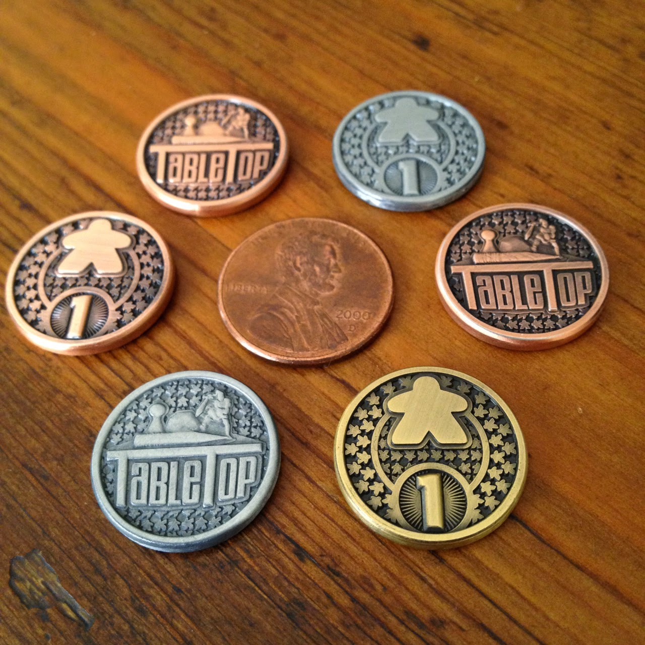
The kind folks at Campaign Coins asked me a few months ago to design a special commemorative coin for Tabletop Day . You can see the meeple-licious results above. You can find this commemorative coin in three colors, Copper, Silver, and Gold, but only in the promotional Tabletop Day kit at your local Tabletop Day event this Saturday April 11!

Trickster Card Back

Image
My plan for the Trickster line is to have the same seven suits across the entire line. When new decks are released, I just put out seven new characters arrayed across those universal suits, so you can combine characters from different genres and IPs. That means I need a universal card back that would remain evergreen across the whole line. I didn't want to get stuck in the " Deckmaster " situation, where the card back has obsolete branding elements locked in perpetuity. I decided to follow the example of Pairs , and lift elements from classic card backs. I just whipped the above card back up over the weekend, pulled together from a bunch of stock Victorian floral patterns and vintage labels. It feels a bit slapdash, with some odd gaps and tangents floating around, but it's sufficient for a prototype.

Sprites for A La Kart

Image
Just another little peek at the art I've commissioned for A La Kart. These sprites come from Fabio Fontes , whose pixel art you may recognize from Pixel Tactics. ( Now on kickstarter! ) I usually do not recommend getting art too early in game development, but in my case it helps to keep my design direction clearer. In this case I'm reminding myself to keep true to the Mario Kart inspiration: Approachable premise Simple mechanisms with fast interactions Variable terrain tactics Frequent opportunity for little victories  That's the goal! So far so good.

A La Kart - Concept Art

Image
I'm really pleased to share the first look at the branding and concept art for A La Kart , the racing card game currently in development. The game is designed to be accessible, affordable, but with the customization options of a light CCG. It will be released as a series of 2-player duel decks starting with Sugar vs. Spice at Sundae Speedway . Check out the concept art of the first two racers from Kaitlynn Peavler and Kristina Stipetic !  The Sugar deck is for the defensive player. She's sweet on the surface but always just a few steps behind the leader of the pack, ready for an opportunity to take the finish line at the last second. She's got great recovery, but a low maximum speed. The Spice deck is for the speedster player. She's optimized for high-speed straightaways and reckless daredevil maneuvering. She's vulnerable to hazards, but her accelerates fast once she's recovered.

SPX: A Great Source of Art Talent for Tabletop Games

Image
( Photo Source ) This weekend we attended the Small Press Expo (SPX), a convention devoted to independent comics creators at every level of the industry. This year was the 20th anniversary of the show and my second year volunteering alongside my wife. She's the real fan of the two of us, with a long-standing love for indie comics and creators. I came into the fandom a bit late, but it's such a welcoming and vibrant community that I never felt out of place. After weeks of awful news coming from gamer culture, it was such a positive experience at SPX seeing diverse creators and fans in a niche community all supporting each other. It can happen, people! I've seen it! But I really recommend SPX to tabletop game designers because it is an excellent place to network with lots of undiscovered and rising talent. You can check out the artists I talked to at SPX on my pinterest board here . Specifically for "SPX 2014" tag in the description. Also check out the SP...

Light Rail Progress Report

Image
Light Rail will be one of the more simple and elegant games in my catalog. Fast gameplay, approachable but difficult decisions, tricky spatial strategy elements, and a fair bit of luck. Playtest comments have all been positive for a light filler. Experienced gamers like the twist of sharing routes as an area majority mechanism instead of routes being exclusively one type. Puzzling out the logic of the emergent game board has been the most difficult hurdle, but that might be the one little fiddly rule that makes the game a satisfying challenge of mastery. My aim from the earliest iterations as "Train Town" was to make a tile-based path-building game as approachable as Tsuro , replayable as Carcassonne , using no components aside from cards. I think it's pretty much baked! The only rough edges are some graphic design issues to make the Building icons distinguishable against the background at a distance and wording the Objectives more clearly. Minor photoshoppin...

Monsoon Market Art Preview

Image
Here's a quick preview of the art in Monsoon Market, the game of fast fortunes on the Indian Ocean. It's a time of peace and profit! There is abundant trade between East Africa and China, and whoever runs a port city can get rich quick. The game is a race is to get fifteen seals of approval from Zheng He, the Chinese Imperial mariner visiting every port on the Monsoon Market. You earn seals by using Gems, Books, Peppers, Silks, Leathers, and Wood to fulfill orders as they come into your port. The first four goods come in quantities of 1, 2, 3, or 4. Several of the 1s are actually hybrid cards, which may be used as either of two goods, but still only a quantity of 1. Leather is always in a quantity of 3 and Wood is always a quantity of 4, but no orders ever specifically call for these basic commodities. There are three levels of accuracy with which you can complete an order. For the gold rate, you must spend the exact types of goods in at least the quantity noted...

Monsoon Market art, inspired by Jamini Roy

Image
Here's a quick preview of the art I'm putting together for the cards in Monsoon Market . I was really inspired by the style of Jamini Roy, so I tried my hand at emulating his geometric and quasi-cubist rendering in vector. Specifically, I wanted to try my hand at the radial symmetry of traditional playing card art. My aim at the moment is to have four different goods as a primary suit depicted by the top icon and unique piece of art; varying quantities of coins based on rarity, which may also tie into color schemes or a background pattern; and maaaybe a tiebreaker letter if it becomes necessary in playtests. I've hired another designer to do the icons for me so those are just placeholders in her hand at the moment. Rest assured, mashed potatoes aren't a suit in the game. :)