Posts

Showing posts from March, 2015

Trickster: Fantasy - Playtest Results

Image
It was a fast, productive playtest period for Trickster: Fantasy the past few weeks. It was nice to get back into that rapidly iterative process again for a new game. What began as a paper-thin activity is now becoming a very easy-to-learn but surprisingly deep strategy card game that works for groups as big as seven players. Biggest Challenge: Needing More Choices As usual, I began playtesting this concept ASAP. That meant the bare minimum of a functioning system that I knew wouldn't completely break down. Essentially, I had a core loop and not much else. At that point, it was only the second-player who really made a critical push-your-luck decision. Everyone else was sort of on autopilot. To be a truly interesting game, I needed each player to make a decision on their turn. Solution: Hero Powers I always planned for the "Trickster" franchise to be a series of games with uniquely themed artwork, which naturally implied different characters in each deck. That

Heir to Europa Rules Preview

Image
It's almost here! After months of playtests, editing, more playtests, and more editing, Heir to Europa by  +Nick Ferris will finally be coming to DriveThruCards very soon. But first, we need your eyes to do one last typo-hunt and grammar check on the rules document. All those months of editing can really give a team tunnel-vision, so we need a fresh crowd of brains to take one more look and spot anything we missed. Download the rules PDF here. Heir to Europa is a sci-fantasy card game about a world undergoing a succession crisis. The various factions of Europa engage each other in psychic contests to literally win the minds of the people. Players take on the role of shadowy conspirators trying to predict who will eventually win the throne, thereby becoming the power behind that throne. The gameplay is based on classic trick-taking card games, heightened with very clever twists that open up subtle new strategies and surprising tactics. Certain cards have special abilit

5 Pitching Lessons from Tabletop Deathmatch (so far)

Image
I've been watching season two of Tabletop Deathmatch with avid interest. The production values, presentation, and overall organization is light-years past season one. (And season one was pretty good!) To recap: Tabletop Deathmatch is a reality show competition held by Cards Against Humanity and its business partners to find the next great tabletop game. The first eight episodes this season focused on introducing and teaching each game in the contest. No judging, just tutorial. This bit was fun to watch for general interest, but I was much more eager to see the subsequent evaluation by a team of top industry judges. So far only four of these judging episodes have been released, but each has offered extremely useful advice for any beginning designer. Here are five lessons I've pulled out so far, in no particular order. Present the game you have on the table right now.   Not the game it could be or the game it used to be. If you've worked on a game a while, it'

Kigi will be published in Japan!

Image
Big news! Kigi will be officially translated and published in Japan by Gamefield ! In Kigi, players "paint" a tree by placing cards along branching organic paths. It's a very easy game to learn, but presents interesting spatial puzzles and lots of replay value. This game has been a huge hit with families with varying play experience. Get the English edition here! Here's a video tutorial: Here are some photos of the original edition. The release date and final packaging isn't determined yet, but I'll keep you posted!

Brainstorming a Legacy-Style Trick-Taking Card Game

Image
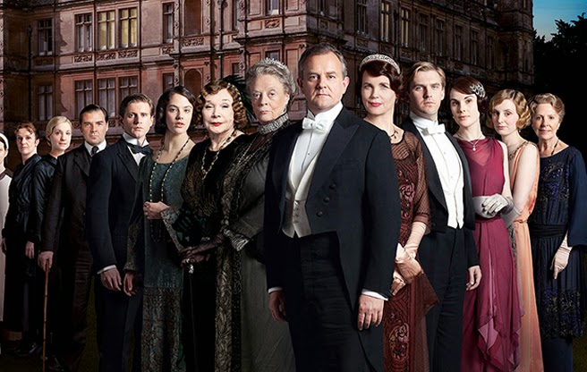
I've long felt that the persistence mechanics from Risk: Legacy would translate well to a card game and be a natural fit for the print-on-demand market. (Check out this old post from 2012 breaking down my early thoughts on what it takes to "legacy" an existing game.) I just couldn't figure out a good theme for the game. Well, this morning I had a quick brainstorm over twitter with Quinn Murphy, and he really unlocked a juicy premise: The theme is a generational family drama, like Downton Abbey. The fallout from each game represents the shifting fortunes and relationships between each of the characters. Let's assume you could add legacy mechanics to a trick-taking game. Each card has potential relationships with any other card in the deck, waiting to be filled in after several games. In time, you'd have a complex web of relationships between any two cards. For example: Indebted to... This card cannot win a trick if ____ is also in play. Married

Interview on Inquisitive Meeple

Image
The Inquisitive Meeple just posted a very long interview with me over here . We cover a LOT of territory there, including graphic design, getting started in the game design craft, and the false binary choice of print-on-demand vs. traditional publishing. Here's a snippet: When you talk about elegant games or game design – what do you mean? Daniel: Smarter people than me have talked about this at length, but these days I prefer the term “ eloquent” over “elegant.” The past few years, “elegant” has become synonymous with “minimalist,” but that is not always the case. Elegance is simply a ratio of the complexity at the start of the game to its complexity in the middle-to-late game. A game can have a relatively high learning curve, but if it opens up into a constellation of even more interesting choices, then it’s still elegant. A game can have a very shallow learning curve, but not open up at all, so it’s not elegant. Meanwhile, I like “eloquence” because it im

Seeking Playtesters for Trickster Fantasy

Image
Howdy folks! I'm happy to announce an open playtest period for Trickster: Fantasy , the first in a series of light card games, featuring new art and mechanical twists in each deck theme. You saw an early draft of this game last week , but after some rapid iteration it's ready for public playtests! This game is suitable for big group gatherings where you want an "icebreaker" that gets everyone to the table for a few minutes. I want to make sure the core game is 100% solid before adding the "fantasy" twists, which is where you come in! Check out the link below and share your thoughts! --> Download the PDF here

A Trick-Taking Game without Numbers

Image
[UPDATE MARCH 17, 2015: The draft below is saved for posterity. If you want to playtest the current iteration of Trickster: Fantasy , check out this post for details .] Here's a quick outline of a trick-taking game using cards that have no numbers. This takes a bit of mechanical inspiration from Niya, Set, Iota, Little Devils, and an old military drinking game . Many thanks to Stephanie Straw for kicking the cobwebs off this old idea. It's been clunking around in the back-burner for a while and it will finally reach the testing table soon. Trick-Taking Game without Numbers 3-7 players The Deck: 49 cards with 7 different foregrounds and 7 different backgrounds. Each card is a unique combination of foreground and background. Setup: Each player drafts a hand of 7 cards using the pick-and-pass method from 7 Wonders or Sushi Go . Remaining cards are set aside and won't be used during the game. The owner of the game takes the first turn in the first round. Turns p

Interview: Talking about "A La Kart" on The Dice Section podcast!

Image
Thanks to all the playtesters who have joined in the March playtests for A La Kart so far! It's been wonderful seeing so many people take interest in this odd little idea for a card game series. I paid a visit to The Dice Section podcast headquarters last week to talk about how the playtests are going. You can listen to that episode here. We talked about classic video games, playtesting with a large community, and just general geekery. It was a blast! Also! This is just a reminder to sign up if you want to access the live rules doc, download print-and-play files, and join discussion about deck balance or card redesigns. Sign up today!

A Quick Introduction to Typography Grids in Graphic Design

Image
Yesterday on BoardGameHour, the discussion focused on writing and formatting rulebooks. I'm no writer, as you might be able to tell from my rambling blog posts, but I can speak a little bit about the basics of how to organize images and text on a printed page. For that, we come to one of my favorite tools in graphic design, the grid . You might be familiar with the idea of a grid being something like this , but in graphic design the grid is more like a waffle. Like syrup, your text and images fits into the cells while keeping the borders clear. The idea is that you do not see the borders of the grid, only the cells. Text and images span these cells vertically and horizontally, but the grid keeps things looking nice and organized instead of a jumbled mess. Here's a quick overview of what grids do, some examples, and a downloadable template I made just for you! What do grids do? Wrangles lots of different elements onto a page. Grids let you organize body text, heade

How to Play Kigi: The Card Game of Pretty Trees and Tricky Choices [Video]

Image
Check out this video tutorial for how to play Kigi , my card game about pretty trees! It's a very simple game but I was surprised how much I had to prune in order to come under the 5 minute mark. Get it? Trees? Pruning? Hee. Kigi (and the full rules) are available here!

Game Mechanics and Art Direction

Image
While preparing for A La Kart 's long-term development, I played or researched as many "Cards with Words" games as possible. That's CCGs, LCGs, deckbuilders, digital card games, and any tabletop games that happen to have a lot of cards. That research has been as much about graphic design as game design. One pretty consistent rule of thumb has been that art goes at the top and text at the bottom, perhaps with a cartouche of important info on the top left. I wondered aloud on Twitter why that tradition had become the rule for so many games. Kevin Wilson dropped some wisdom from his years of experience in the field: @DanielSolis As others thought, players come to associate the text with the card art, which is easier to distinguish at a glance than text. — Kevin Wilson (@KevinWilson42) March 5, 2015 "Cards with words" games tend reward deeper familiarity with the text, especially if you build your own deck. Once you've memorized the text,

March is Crowded with Crowdfunding!

Image
Wow, there are a LOT of kickstarter campaigns launching or ongoing this month. Someone must have sent up a flare or something. Amidst the crowd, you may have missed a few projects. Here are a few tabletop game projects you should support that haven't been funded yet, in order of how close they art to deadline. Dead Scare: (6 Days) Four-woman team publishing a horror RPG about 1950s ladies dealing with the undead. Aether Magic: (6 Days) First game published by the very nice folks at Happy Mitten Games, with art by Jacqui Davis. Fujian Trader : (15 Days) Euro game inspired by (and played upon) a rediscovered 17th century map of East Asia. Bottom of the Ninth : (22 Days) Newest game from Dice Hate Me, baseball themed but cutting straight to the very end of the game. Far Space Foundry : (29 Days) Really cool-looking space-themed game with great classic aesthetic. RESISTOR_ : (30 Days) Very cool abstract card game about two AIs competing to win the singularity. I reall

40 New Tabletop Icons Now Available!

Image
Every month, I release a new batch if tabletop game icons under a creative commons attribution license! You can find this month's release and all the other past icons at my Patreon page here . If you want to support more icons, please consider becoming a patron ! They're all free to download, use, remix, and print even in commercial projects. I just need an attribution and a link to my Patreon: https://www.patreon.com/danielsolis