Posts

7 and 1: Avoiding Confusion
Image
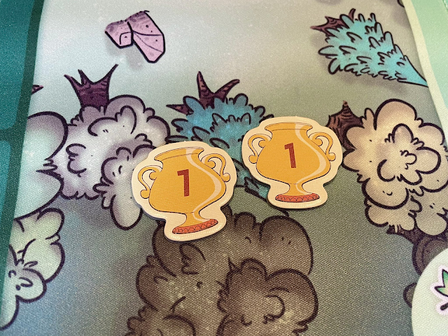
  Photo of two tokens. One with a one and one with a seven but they look almost identical making it hard to differentiate. ( Source ) Some typefaces don’t have enough distinguishing features between their 7 and 1. The usual culprits are sans serif, modernist, or futuristic fonts that have removed so many distinctive features of their characters that they become indiscernible from each other. You may also run into this problem with italicized numerals, where a slanted 1 could be confused for the angle of a 7. 7 should have an exaggerated angle, with a wide stance that significantly extends its top bar. It may also be handy to have a small crossbar across the midsection, though this is not a common attribute. Avoid any 7s that have a serif base, since that is more common for a 1 and may lead to further ambiguity. 1 is should be upright, to contrast the 7's lean. You can look for an even MORE simplified 1 that is so abstract that it just becomes a skinny vertical line. Just be careful...

"Snappy Dresser" Card Template

Image
As a little weekend hobby project, I was thinking about how some of the concepts and visual language of Marvel SNAP would translate into a printed card.  Very quickly, this spun out into its own concept. I imagined the cost and strength would both have to be locked to the top left for ease of reference. I minimized the cost icon to be less prominent since you'd rarely have to look at it while it's in play. The basic, ongoing, and reveal abilities ought to have distinct backgrounds so you could quickly scan the board for triggers.  The artwork here comes from "Aguila Negra" (Black Eagle) issue #100, a Portuguese language comic from 1966 that is now in public domain. I loved that this guy wearing a full knight costume would don a disguise OVER his costume, including sunglasses over his mask and a fedora over his helmet! Quite a snappy dresser indeed! You can download this Photoshop file at the Patreon post linked below.  » https://www.patreon.com/posts/82651355 This inc...

Troubleshooting: How to fix "Remove Blank Lines for Empty Fields" in InDesign Data Merge

Image
I'm working on a card design that has multiple variables within the same text field. Each variable is its own paragraph with its own Paragraph Style. It's rare that every card has content for each variable ABC though. Usually it's a mix, like AC, AB, or BC. The issue is that when you delete empty lines, sometimes the remaining paragraph gets re-assigned the deleted paragraph's style. Compound this over a whole document and you can see why it's a pain in the butt. Here's a video explaining the situation: Here's my solution: To reliably remove blank lines from a merged document, first do NOT activate "Remove Blank Lines for Empty Fields" in your Content Placement Options. It's often too buggy to be reliable, except in the most simple cases where all of the paragraphs have the same style anyway. Then Create Merged Document as you normally would. The resulting document will have a lot of blank lines because of the empty fields. Here's what you ...

Junk Orbit is back! In box form!

Image
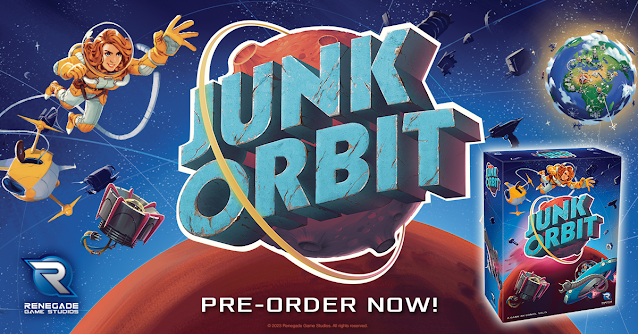
Howdy folks! Big news announced yesterday from Renegade! There will be a new edition coming with new content, some rebalanced ship powers, bigger ship meeples, and all in a proper box! From the publisher: https://renegadegamestudios.com/junk-orbit/ New Features! New box! Now in a standard box with a fitted plastic tray for tile storage! Solo mode included! 2 mini expansions included! The Mission Control promo pack with new ship cards and player powers and Tours Mini-Expansion with new Tourist cards and ways to score!

"Tolstoy" by Sid Sackson (Excerpt from "Beyond Words")

Image
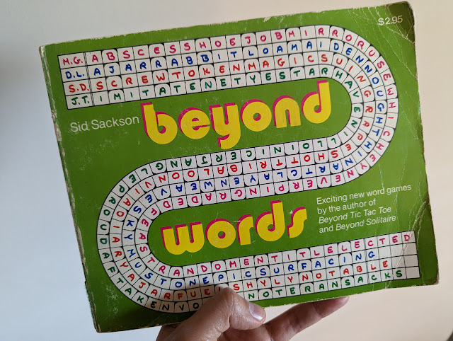
Cleaning out some old office furniture, I stumbled across a cache of vintage game books I purchased from Dickson Street Books  many years ago. Among the collection is this well-loved 1977 edition of Beyond Words by Sid Sackson, the legendary designer of Acquire and Can't Stop.  This was the third in his series of "Beyond" game books, the first two being Beyond Tic Tac Toe and Beyond Solitaire . This book contains six word- and letter-based games named in honor of famous writers. The book presents short rules for each game, followed by perforated sheets that you were meant to pull out and play on with pencil or pen. Kind of a crossword or word jumble book you'd find in a supermarket checkout. The first of these games is titled "Tolstoy," which I share below.  First, some historical notes if you've never read rules by Sackson. I've often considered Sackson's designs years ahead of his time, yet I still get tripped up by how he writes his rules. I...

New HeroClix card format!

Image
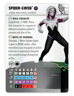
The new #HeroClix card format is now public! The main goal was to bring more attention to the sculpt, not having it cropped to a little bust on the corner. That dominoed into a few other measures to conserve space, compress reference information, and generally make the game easier to approach. I learned a lot! While I'm happy with this first wave, the future waves look even better now that the template is stabilized and future-proofed. See official release for details: https://wizkids.com/heroclix/2023/01/30/breaking-new-ground-heroclix-2023-rules-4-comprehensive-rules-and-miscellaneous-changes/ 

Label Punchboard Sheets in Board Games

Image
I'm trying to make it standard that punchboard sheets label the components in the negative space between die cuts. My hope is that this helps the customer during the unboxing process as they're sorting out their bits. I know it might seem redundant if they're also looking at the rulebook as an inventory list, but I'm always trying to find ways to improve the customer experience. Sometimes that means an extra affordance that 99% of customers won't notice, but that 1% who feel served will be very vocal about their satisfaction. What would you like to see added to punchboard sheets in board games? For more tips and tricks, please sub to my patreon at patreon.com/danielsolis.