Posts

Zoomies: a Trick-Taking Game for the Mirror Deck

Image
Hi all! Following up my earlier post about analyzing the unique aspects of the Mirror Deck, I promised a trick-taking game using the deck. Here it is! -~-~-~-~-~-~-~-~-~-~- Zoomies A trick-taking game for the Mirror Deck. You are cats wildly climbing up and down. The player with the most points gets in trouble for breaking the furniture. The player with second-most points at the end of the game wins. Overview Players: 4 Time: 15 Min Age: 8+ About the Mirror Deck This deck is 54 numbered cards. Each card is numbered 1 through 99, but each two digit number can be reversed. For example, the 53 card is also the 35 card. All the single-digits’ counterparts are multiplied by 10. For example, the 01 card is also the 10 card. Setting Up the Game Shuffle the deck and set it to the side of the play area. Remove 2 cards from the deck. They will not be used in this game. Setting Up Each Round The game is played over three rounds. At the start of each round, deal cards from the deck to each playe

Analyzing the Mirror Deck for Game Design

Image
It's been a few years since I created the Mirror Deck and posted it on DriveThruCards . As a reminder, it's a deck of cards numbered 1 through 99, where each number can have its digits transposed, so the deck is only 54 cards. I asked some advice from other game designers recently on where to take the deck next. James Ernest was especially helpful, recommending that I look for any rarities or natural "sets" in the deck that would lend themselves to game mechanisms.  I'm looking at how I can make a two-player trick-taking game out of the Mirror Deck. Triangular Numbers There are 13 triangular numbers in the deck's range, which I could mark with a triangle "suit" icon. 1, 3, 6, 10, 15, 21, 28, 36, 45, 55, 66, 78, 91 Perfect Squares There are 9 numbers in the deck's range, which I could mark with a square "suit" icon.  1, 4, 9, 16, 25, 36, 49, 64, 81 Primes There are 25 prime numbers in the deck's range, which I could mark with a &quo

Designing Punch Out Components for Board Games

Image
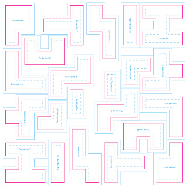
These components go by many names in the industry — Chipboard, Punchout, Punch Sheets, or Cardboard — but I typically just say “punch board” out of habit. They all refer to thick cardboard pressed between two glossy color laminate sheets on either side. A factory can create custom dies that perforate these sheets into different patterns, then the resulting tokens can be punched out of the sheet. (Packaging and shipping tokens still connected to a sheet protects them in transit until they’re purchased.) Before getting too far along in your design process, consult with your factory representative to confirm they are able to achieve your requests. They’ll offer solutions that best suit your needs at a budget you’re able to sustain. They will also explain how they prefer to have their files delivered.  Assume all punch board components require designated bleed, trim, and safe zones just like a card design. However, the thickness of the sheet determines how strict those margins need to be.

A Visit to Sid Sackson's Archives

Image
After legendary designer Sid Sackson passed, the Strong Museum of Play became the home of his personal papers. This collection includes correspondences, journals, prototypes, sketches, and a bunch more ephemera from his long career. His diaries alone spanned 35 years and were intricately indexed. It will take years to transcribe and digitize them all, but the early parts of his career are up on the Sid Sackson Portal here:  https://sacksonportal.museumofplay.org/s/sackson-portal/page/welcome A year after the portal's launch, Julia Novakovic posted an update on the project's ongoing road map for future transcription and public display:  https://www.museumofplay.org/blog/the-sid-sackson-portal-one-year-later/ But before the portal went online, the only way to see any of these papers was to go personally to the Strong Museum and schedule a visit with the curator. (Many thanks to Julia for giving a rando like me access to these artifacts!) My wife and I paid a visit to Rochester to

Translating Game Text to Language-Neutral Diagrams

Image
Good news! I've submitted the final draft of my book "Graphic Design for Board Games" to the publisher! Of course that now leaves a void in my schedule for some other long-term project. I'm not yet certain what that would be, so for now I'll continue sharing early drafts and previews of what I've written for the book. The following section comes from the chapter on designing language-neutral diagrams. In this sub-section, I discuss the practical process of diagramming each part of a game action into glyphs and icons.

Three Principles of Card Design: Visibility, Hierarchy, Brevity

Image
This is an excerpt from the rough draft of my book  Graphic Design for Board Games.  If you want early sneak peeks at the rest of the draft, including editorial comments and discussion, head over to my patreon ! 

What to do with Trickster, hmmm...

Image
I've got the rights to Trickster back in my hands! I'm considering where its future may lead.  Trickster was my first attempt at really pushing print-on-demand as a primary distributor. It was an ambitious plan back in 2015. In those days, it was a series of individual small-deck card games. The deck sizes were optimized for best margins and ease of shipping from POD. Each deck was standalone, but could be shuffled together. The core rules were the same for all of the games, but the cards in each deck had unique abilities. (I would attempt this again with the " I Can't Even " series and with the  Plume  decks.)  After releasing the fourth deck, Trickster got picked up by a publisher as a  big box edition on Kickstarter , with a new look at revised theme. Unfortunately it never really caught on in retail. I think it's really better for a small indie channel like DriveThru. I'd been waiting for the retail inventory to run low before promoting the classic de