Posts

Showing posts with the label graphic design

Designing Punch Out Components for Board Games
Image
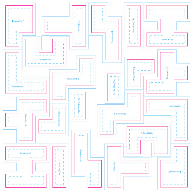
These components go by many names in the industry — Chipboard, Punchout, Punch Sheets, or Cardboard — but I typically just say “punch board” out of habit. They all refer to thick cardboard pressed between two glossy color laminate sheets on either side. A factory can create custom dies that perforate these sheets into different patterns, then the resulting tokens can be punched out of the sheet. (Packaging and shipping tokens still connected to a sheet protects them in transit until they’re purchased.) Before getting too far along in your design process, consult with your factory representative to confirm they are able to achieve your requests. They’ll offer solutions that best suit your needs at a budget you’re able to sustain. They will also explain how they prefer to have their files delivered.  Assume all punch board components require designated bleed, trim, and safe zones just like a card design. However, the thickness of the sheet determines how strict those margins need to ...

Translating Game Text to Language-Neutral Diagrams

Image
Good news! I've submitted the final draft of my book "Graphic Design for Board Games" to the publisher! Of course that now leaves a void in my schedule for some other long-term project. I'm not yet certain what that would be, so for now I'll continue sharing early drafts and previews of what I've written for the book. The following section comes from the chapter on designing language-neutral diagrams. In this sub-section, I discuss the practical process of diagramming each part of a game action into glyphs and icons.

Three Principles of Card Design: Visibility, Hierarchy, Brevity

Image
This is an excerpt from the rough draft of my book  Graphic Design for Board Games.  If you want early sneak peeks at the rest of the draft, including editorial comments and discussion, head over to my patreon ! 

7 and 1: Avoiding Confusion

Image
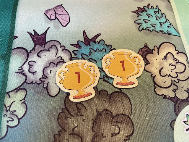
  Photo of two tokens. One with a one and one with a seven but they look almost identical making it hard to differentiate. ( Source ) Some typefaces don’t have enough distinguishing features between their 7 and 1. The usual culprits are sans serif, modernist, or futuristic fonts that have removed so many distinctive features of their characters that they become indiscernible from each other. You may also run into this problem with italicized numerals, where a slanted 1 could be confused for the angle of a 7. 7 should have an exaggerated angle, with a wide stance that significantly extends its top bar. It may also be handy to have a small crossbar across the midsection, though this is not a common attribute. Avoid any 7s that have a serif base, since that is more common for a 1 and may lead to further ambiguity. 1 is should be upright, to contrast the 7's lean. You can look for an even MORE simplified 1 that is so abstract that it just becomes a skinny vertical line. Just be careful...

"Snappy Dresser" Card Template

Image
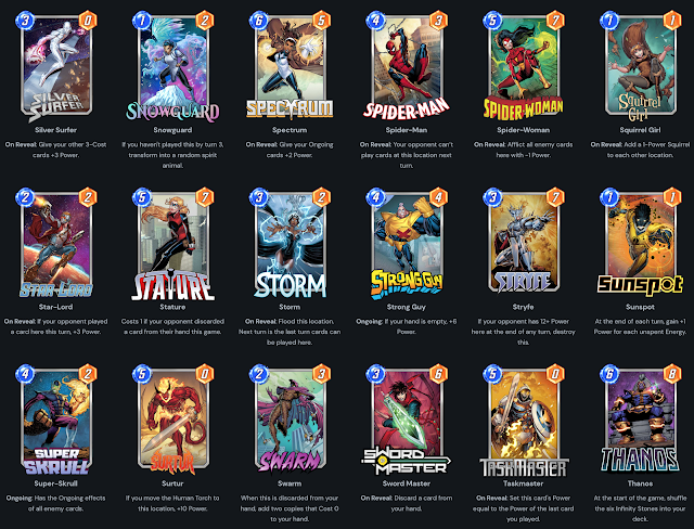
As a little weekend hobby project, I was thinking about how some of the concepts and visual language of Marvel SNAP would translate into a printed card.  Very quickly, this spun out into its own concept. I imagined the cost and strength would both have to be locked to the top left for ease of reference. I minimized the cost icon to be less prominent since you'd rarely have to look at it while it's in play. The basic, ongoing, and reveal abilities ought to have distinct backgrounds so you could quickly scan the board for triggers.  The artwork here comes from "Aguila Negra" (Black Eagle) issue #100, a Portuguese language comic from 1966 that is now in public domain. I loved that this guy wearing a full knight costume would don a disguise OVER his costume, including sunglasses over his mask and a fedora over his helmet! Quite a snappy dresser indeed! You can download this Photoshop file at the Patreon post linked below.  » https://www.patreon.com/posts/82651355 This inc...

Troubleshooting: How to fix "Remove Blank Lines for Empty Fields" in InDesign Data Merge

Image
I'm working on a card design that has multiple variables within the same text field. Each variable is its own paragraph with its own Paragraph Style. It's rare that every card has content for each variable ABC though. Usually it's a mix, like AC, AB, or BC. The issue is that when you delete empty lines, sometimes the remaining paragraph gets re-assigned the deleted paragraph's style. Compound this over a whole document and you can see why it's a pain in the butt. Here's a video explaining the situation: Here's my solution: To reliably remove blank lines from a merged document, first do NOT activate "Remove Blank Lines for Empty Fields" in your Content Placement Options. It's often too buggy to be reliable, except in the most simple cases where all of the paragraphs have the same style anyway. Then Create Merged Document as you normally would. The resulting document will have a lot of blank lines because of the empty fields. Here's what you ...

New HeroClix card format!

Image
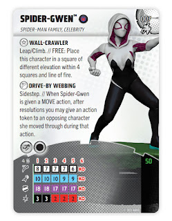
The new #HeroClix card format is now public! The main goal was to bring more attention to the sculpt, not having it cropped to a little bust on the corner. That dominoed into a few other measures to conserve space, compress reference information, and generally make the game easier to approach. I learned a lot! While I'm happy with this first wave, the future waves look even better now that the template is stabilized and future-proofed. See official release for details: https://wizkids.com/heroclix/2023/01/30/breaking-new-ground-heroclix-2023-rules-4-comprehensive-rules-and-miscellaneous-changes/ 

Label Punchboard Sheets in Board Games

Image
I'm trying to make it standard that punchboard sheets label the components in the negative space between die cuts. My hope is that this helps the customer during the unboxing process as they're sorting out their bits. I know it might seem redundant if they're also looking at the rulebook as an inventory list, but I'm always trying to find ways to improve the customer experience. Sometimes that means an extra affordance that 99% of customers won't notice, but that 1% who feel served will be very vocal about their satisfaction. What would you like to see added to punchboard sheets in board games? For more tips and tricks, please sub to my patreon at patreon.com/danielsolis. 

Making a Better Drop Shadow

Image
  New video! Here's a simple trick I've used for years to make a better drop shadow than the default shadow you get from layer effects. Hope you find it useful!

Components and Setup in Rulebooks [Video]

Image
Here are the two basic methods we've used for laying out diagrams in Components and Setup sections of our board game rulebooks. There are slight variations between these two extremes depending on the game, but generally they start with either of these two options. Combined This is one diagram showing a complete game setup. I use numbered tags to that correspond to each step of setup and lettered tags that indicate each game component. Components and Setup from Atlantic Robot League Pros: Saves space. Great for small games or small books. Cons: Can be crowded. Difficult to see the smallest components. Doesn't easily account for optional modules or variable setups. Separate This is a more traditional option you'll see in most rulebooks. There's one "contents" or "components" section, usually a full page or a spread. The components will be neatly organized into a clean grid and individually labelled for ease of reference. The components are not at accur...

In Praise of Marvel SNAP's character logos

Image
  Like everyone else late last year, I got pretty hooked on Marvel SNAP. But enough ink has been spent praising the elegant gameplay, clever wagering strategies, and rather generous business model. I'd instead like to highlight the logos! The little names you see on every card in the game. Having worked on several Marvel card games in the past two years, I've certainly considered giving every card their own masthead name like this, but the challenge is always three things: Not every character has an iconic masthead to pop onto the card. Some characters have just not headlined their own comic series, so there's no precedent for their logo. We have limited graphic design resources that need to be spent on boards, rulebooks, tokens, packaging, marketing, and web. There's just not room in the pipeline to make a whole new brand logo for each character. Even if we had the bandwidth to do it, space on our components is so limited that a big masthead would cut into valuable rea...

Board game spaces on paths in Adobe InDesign [Bargain Basement Bathysphere]

Image
Sometimes when you're designing a game board, you want to use a meandering path of spaces like an old Snakes & Ladders game. A simple grid simply won't satisfy all the branches, twists, and turns the game requires. That's the challenge presented when we had to lay out the new maps for  Bargain Basement Bathysphere . This layout uses a very clever solution that I'd like to share with you today! The Design Challenge In the image above, you can see how a final map has a serpentine layout, filled with several types of spaces at irregular intervals. We needed a layout solution that would do the following: Allow us to adjust paths of an entire sequence of spaces without having to manually move and rotate every single object. Keep a literal line connecting the spaces to one another, but it must be in the background and ideally not require a lot of manual editing either, since there will be many paths. Use linked images for the spaces rather than making raw vector shapes. T...

"These Books Do Not Exist" Jigsaw Puzzle

Image
My new jigsaw puzzle just dropped! » THESE BOOKS DO NOT EXIST 20 covers from (nonexistent) author Clubworth Croak, all in one dizzying image. This includes all your favorite novel cover tropes: Cloak Guy! Silhouette of Lady with Hair Bun! Inexplicable still photo of one object on a neutral background! And more! Phew! This took a long while to put together! Hope you have fun with it! 

Wireframe Card Designs for Patrons

Image
New goodies for all my patrons! I had a request for some wireframe card designs for different types of games, so here 's a test batch for you. These are available in EPS, JPG and an IDML file. Hope you find these useful! If you'd like to see more, please comment on the Patreon post here . Thanks!

Card at Work: 11 - Inserting Optional Line Breaks with DataMerge

Image
It's a new episode of Card at Work , the video series covering the basics of designing cards for tabletop games! This time we're building on the GREP tricks from the last episode on inline icons and using similar technique to insert optional line breaks within a single cell of a spreadsheet. Using this method, you can drop a line break into a single block of text without needing a manual line break in the InDesign template itself OR using a find-replace after merging the document. This is my first Card at Work episode in HD resolution. I'm slowly figuring out Adobe Premiere so hopefully these episodes will be even higher quality as time goes on. P.S. I'll be streaming today live at around noon EST. I'll be working on a new round of layout updates for Chimera Station from Tasty Minstrel Games at http://www.twitch.tv/danielsolis81 . Support more videos at my Patreon!

Logo Design Time Lapse Video – Catty B's

Image
Here's a new time-lapse video of a recent logo design for Catty B's , a comedy series from Angela Webber and Lucia Fasano. They were very kind and generous to let me record and share this design process. Patrons $10+ also get a version of this video with commentary about how I designed this logo and some of the decision process. Hope you all find that useful! Thanks to Angela, Lucia, and all my patrons for making these videos possible!

Making Art Direction More Inclusive

Image
When I get the wonderful opportunity to art direct for new characters, it's like opening a big awesome toy box. I have to remind myself of some things so I approach this job responsibly. This isn't necessarily a "tips" list, or in any order of priority, it's just what I try to keep in mind. Hopefully it's something you might find useful, too. An inclusive mindset is a crank, not a switch . It isn't a one-time flip from ignorance to enlightenment. It's an ongoing process of checking self, looking back on mistakes, and making assertive efforts to do better. I've never been and never will be 100% " woke ," but I must keep trying to "wake up." I will make (and have made) mistakes, but that isn't an excuse to stop putting in the effort to be more inclusive. This has real practical impact when I'm working on a project as an art director. As an art director, I have so much freedom to guide artists in certain directions ...

Resizing a Hardcover Design [Patreon Sample]

Image
Hello All! Aside from my Card at Work videos available for the general public, I've been recording more of my real-world process as I work through various design problems with actual projects.  This time the session was short enough and the project simple enough that I thought it would be a good example of a typical recording: In this session , I had to resize the cover of Do: Fate of the Flying Temple to new hardcover specs. However, the current dimensions were waaay different than the new dimensions provided by the printer. This video covers a few different photoshop techniques to make the resize as seamless as possible without losing any resolution. - Layer Effects - Gradient Layer Masks - Layer Groups with Layer Effects That's just this session. The other videos go into more detail about advanced InDesign techniques for even more real-world projects.  The entire archive of real-time sessions are available to all $10+ patrons. I hope you find them useful! Please share fr...