7 and 1: Avoiding Confusion
 |
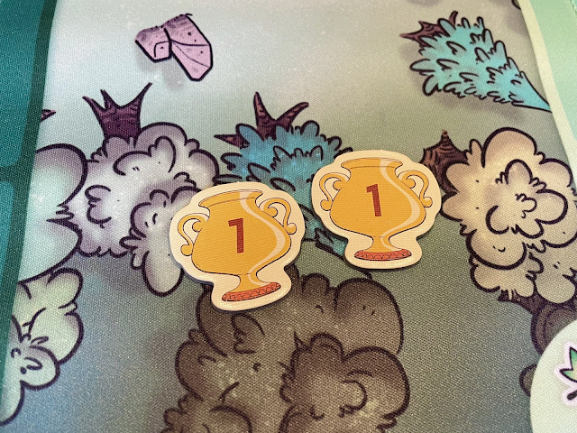
| Photo of two tokens. One with a one and one with a seven but they look almost identical making it hard to differentiate. (Source) |
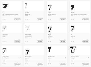
Some typefaces don’t have enough distinguishing features between their 7 and 1. The usual culprits are sans serif, modernist, or futuristic fonts that have removed so many distinctive features of their characters that they become indiscernible from each other. You may also run into this problem with italicized numerals, where a slanted 1 could be confused for the angle of a 7.
7 should have an exaggerated angle, with a wide stance that significantly extends its top bar. It may also be handy to have a small crossbar across the midsection, though this is not a common attribute. Avoid any 7s that have a serif base, since that is more common for a 1 and may lead to further ambiguity.
1 is should be upright, to contrast the 7's lean. You can look for an even MORE simplified 1 that is so abstract that it just becomes a skinny vertical line. Just be careful this wouldn’t be found near a capital I or lowercase l, since those may also be mistaken for a 1. I prefer a 1 that has short, downward sloping top stroke and a strong serif at the base.
If you’re putting these numbers on tokens representing different denominations, like money or resources, then you can put the larger values onto increasingly larger tokens, with 1 being the smallest token. You can also change the colors, ranging from gray at the lowest value to gold at the highest value.
Of course, the easiest solution is to change fonts. However, you may be forced to make manual edits to your numerals in Photoshop or Illustrator. In those cases, adding the details described above should resolve the problem. (But really, it’s better to pick a different font.)


Comments
Post a Comment