In Praise of Marvel SNAP's character logos
Like everyone else late last year, I got pretty hooked on Marvel SNAP. But enough ink has been spent praising the elegant gameplay, clever wagering strategies, and rather generous business model. I'd instead like to highlight the logos! The little names you see on every card in the game. Having worked on several Marvel card games in the past two years, I've certainly considered giving every card their own masthead name like this, but the challenge is always three things:
- Not every character has an iconic masthead to pop onto the card. Some characters have just not headlined their own comic series, so there's no precedent for their logo.
- We have limited graphic design resources that need to be spent on boards, rulebooks, tokens, packaging, marketing, and web. There's just not room in the pipeline to make a whole new brand logo for each character.
- Even if we had the bandwidth to do it, space on our components is so limited that a big masthead would cut into valuable real estate. Plus it's an extra variable to manage in our automation process.
So that's what impresses me most about Marvel SNAP. Those madmen actually did it! They did the thing!
More than that, the logos aren't merely a nice looking ornament, they serve a valuable purpose in gameplay and business model.

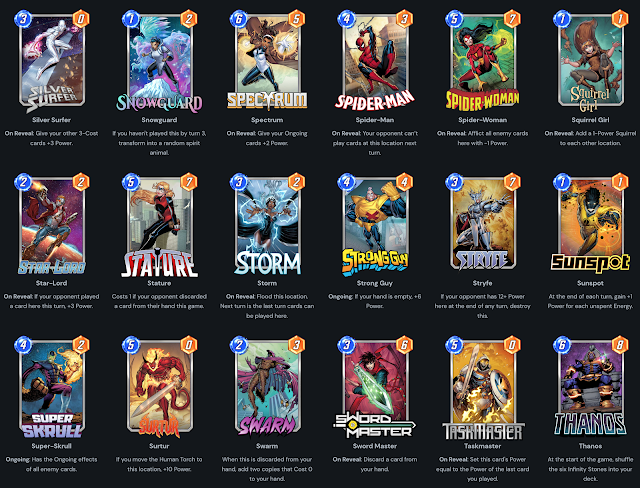
Because every card has any number of variant art options, plus visual upgrades that change the borders and backgrounds, it's especially important that one element remain stable and legible on the play area.
Each logo has its own distinct typographic style and visual treatment that remains consistent even when the rest of the art is wildly different. In the example above, you'd be forgiven for thinking the characters on the right and left were not the same as the middle, but the logo resolves any confusion.
Below I'd like to spotlight some of the logo groups I've identified in the current card pool.
The Headliners

These are your big names like ol' Webhead here. These characters have long-established masthead logos that pretty much come readymade.
When you have decades of comic history backing up a character's brand, it's wise to take advantage of it, rather than fighting it.
Not much else to say with this group. I just want to compliment their decisions here. They opted to keep existing logos when they were available. In some cases, I wonder if they would have preferred to make a new logo, but I think it was smart to capitalize on existing brand equity.
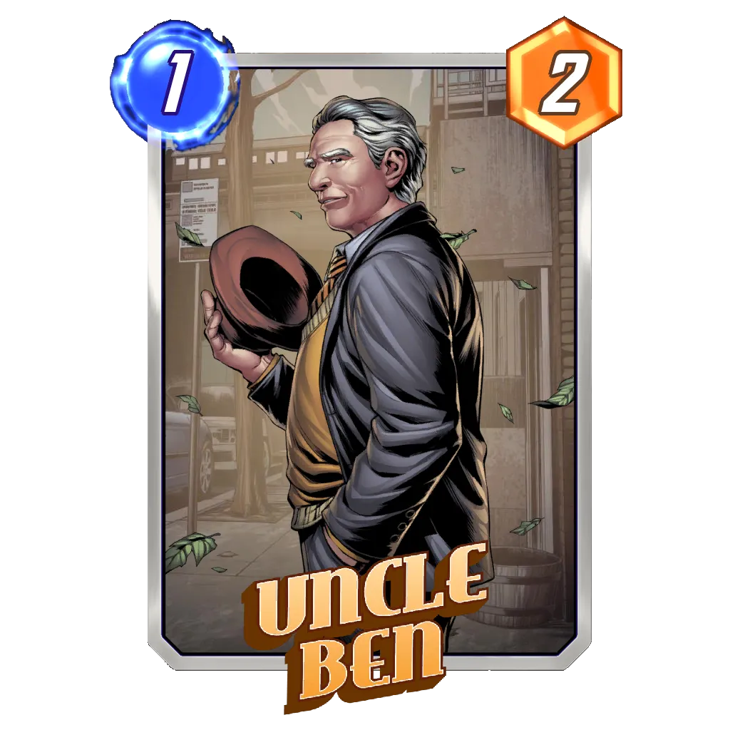
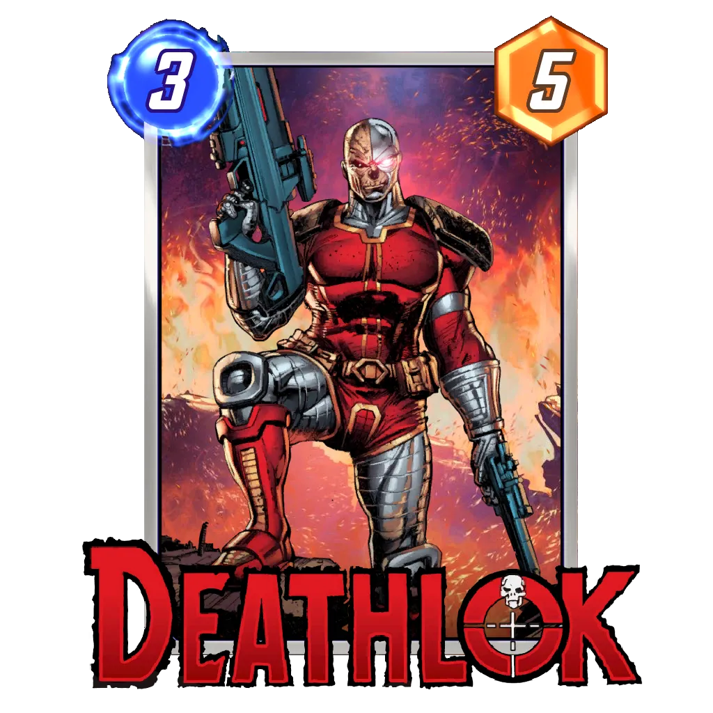
The Underdogs
The Long Names
You may notice that in most of these examples, there are several nested strokes and 3d extrusions. I can't speak with any authority, but I suspect it's because they have to be laid across a border along the bottom of the card.
That presents a problem for logos where the negative spaces have not been filled in. The bottom border resting behind the logo may give the appearance of a

You can especially see this in long names with compressed typefaces, like the logo for Taskmaster. The grey of the basic border almost exactly matches the grey of Taskmaster's logo. A thin stroke and shallow drop-shadow helps set it off from the border, but it's not quite enough.
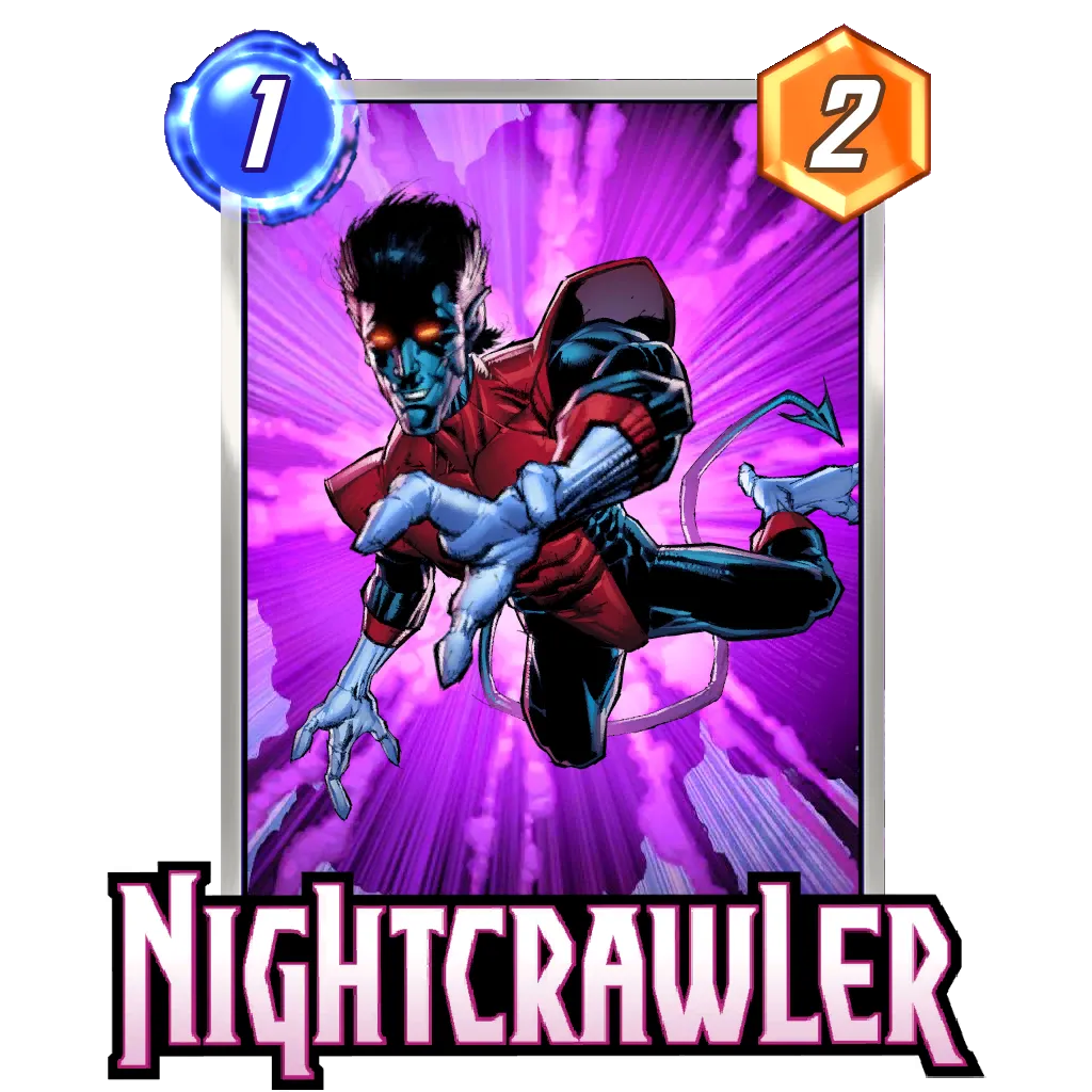
Nightcrawler gets the better deal here, since his masthead is completely filled in and contained by an outer black shape. That lets the light text be legible and blocks out the lower border.
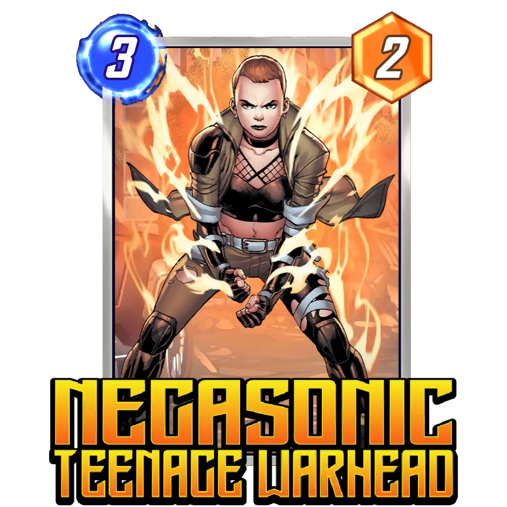
Negasonic Teenage Warhead has to be one of the very longest names in the game. (Heck, one of the longest names in the entire Marvel superhero roster.) They pretty much had to use a compressed font. Further, added a stroke just thick enough to enclose the negative spaces within the A and G. I do wonder if the NEGASONIC is stretched out wider than the font was originally drawn, which is something I'd normally oppose. Hard to tell, so I guess it's just right.
---
What do you think of Marvel SNAP's logo treatments? Have you been playing much?


Comments
Post a Comment