Case Study: Houses of the Blooded Layout
Case Study At a Glance
» Project: Lay out a John Wick's new role-playing game.
» Released in limited edition hardcover with dustjacket.
» Later released as an unlimited softcover.
» Worked with artist Storn A. Cook.
» Also produced a set of icons for FATE aspects.
History
I met John Wick through Jared Sorensen back when that dynamic duo were founding the Wicked Dead Brewing Company. John has a long and storied connection to the gaming industry, starting as the big brain behind the Legend of the Five Rings and 7th Sea game settings. Thereafter, he independently produced a string of smaller books that experimented with mature themes and new game mechanics. John hired me to lay out Play Dirty, an anthology of game advice articles; No Loyal Knight, a supernatural noir detective novel; and Wilderness of Mirrors, a spy-themed role-playing game. Based on those good experiences, he tapped me for his next major project Houses of the Blooded would be John's first "big" game in a few years, so he wanted it to launch with a splash.

Title
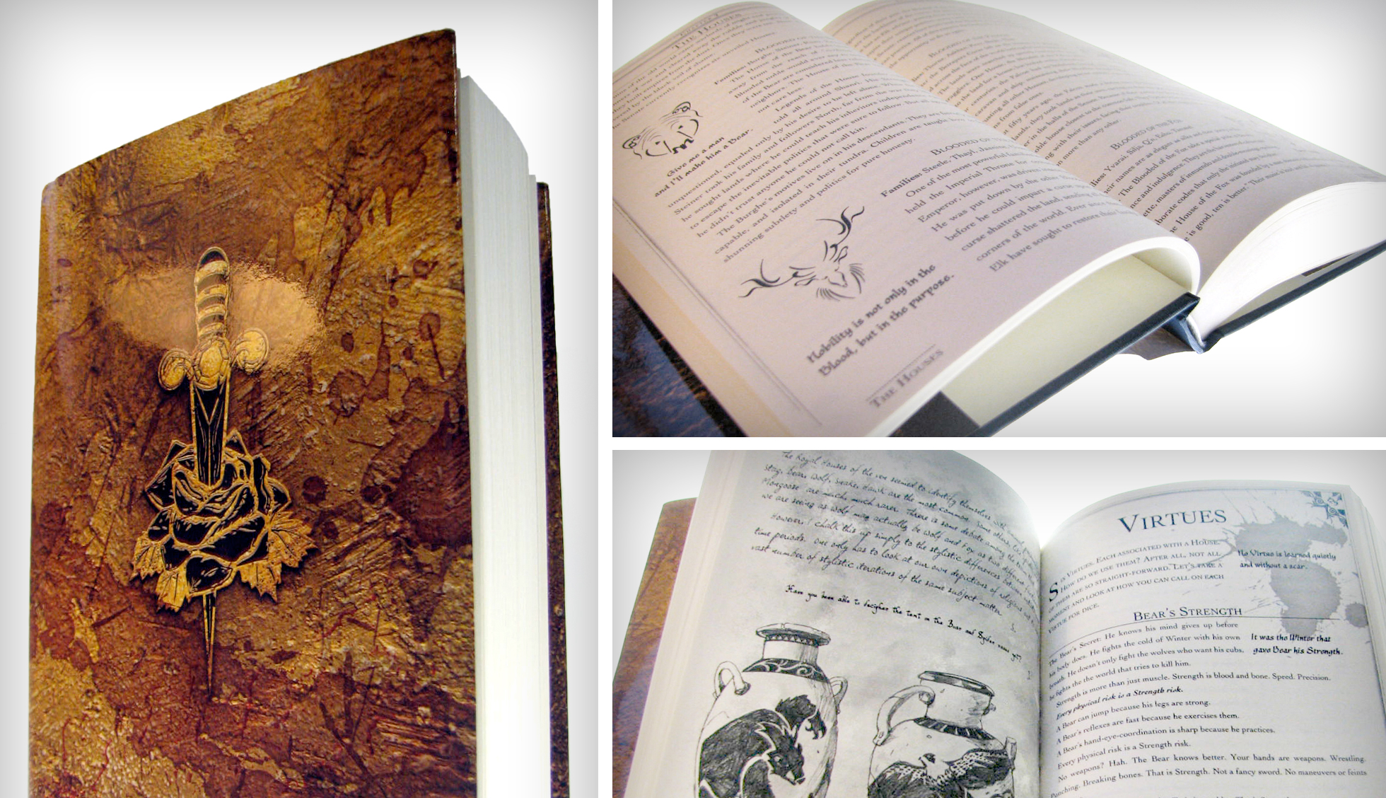
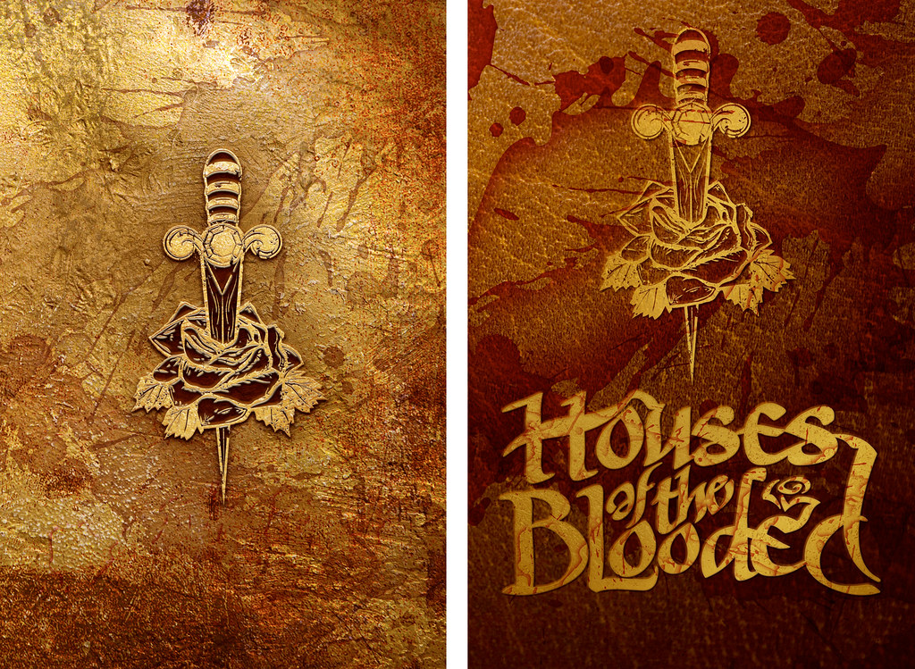
The game is written from the perspective of John Wick, anthropologist and explorer of the unknown. He describes the remnants of the Ven, an ancient lost civilization pre-dating Atlantis. Houses of the Blooded is meant to be both an account of their culture and a role-playing game allowing the players to tell stories in the style and tone of Ven opera. Because the book straddles the line between a work of fiction and an artifact from that fiction, I spent a fair amount of time planning my creative direction. I sketched out the title first, trying to create an ambigram of the words "Houses of the Blooded." Reason being that this is a culture that admires mystery and puzzles. This wasn't as successful as I'd hoped, but it still created an enigmatic, hand-drawn look to the typography.

House Crests
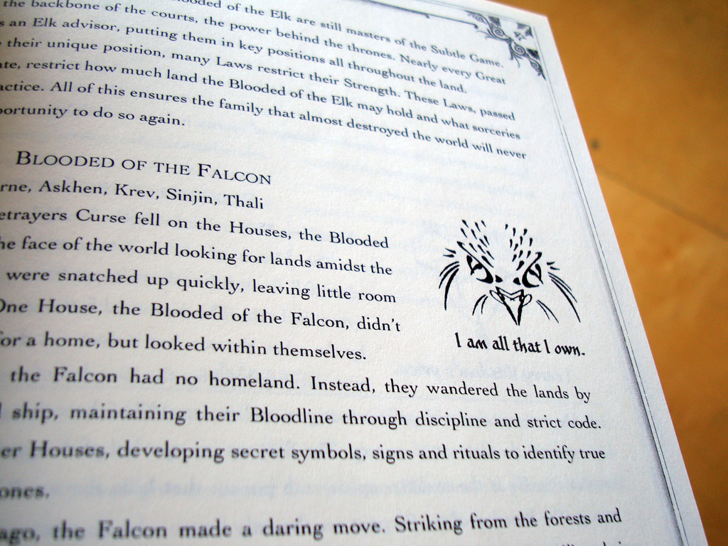
I also created a set of icons for each House of the Ven. Each house is named for a particular animal. These animals also doubled as game stats, so your character might be Wolf 3, Elk 2, and so on. John requested each House have a crest and that the crests also be on the character sheet.
He admired the faux inkbrush animal drawings I did for Greg Stolze's REIGN and wanted something like that for Houses. I felt like the Ven came from a much more ornamented source of inspiration, so I made these crests look as if they were drawn with a proper pen than an brush. These were based partially on letterforms from a calligraphic font, heavily augmented to form the contours of a bear, wolf and the other animals.
The small dots you see on each animal's forehead were a way to keep track of your character's stats. If your character has Elk 3, you'd fill in three dots.

Storn A. Cook's Illustrations
John hired Storn A. Cook to do illustrations for the opening page spreads of each chapter. Each illo also had handwritten notes detailing some additional information about the world of the Ven. I added a light watercolor grayscale beneath Storn's black and white art, to integrate it into the book's aesthetic.

Stock Art
For all the ambitions for this project, it was still on a tight budget. I've become quite experienced with using stock vector art for these situations. However, any professional will tell you it's not enough to just slap some clip art on the page and call it a day. I found some Arabesque decorative vectors, combined them, manipulated them point-by-point, added textures, shadows, and anything else that would be necessary to make them work for this book.
Limited and Unlimited Edition Covers
John planned to release the book as a limited edition hardcover to pre-orderers and VIPs, with a general unlimited edition for long-term sales. The limited edition was a hardcover with a dust jacket, an unusually formal touch for even the most high-end RPG books. That being the case, I designed the limited edition cover to look as if it were the cover of an HBO DVD boxed set, like Rome. Solid gold, with blood splattered across the front. The unlimited edition was designed to look as if it were bound in leather, with raised gold leaf type. It, too, had blood splattered across the front. Both editions continued that motif in their interiors, with splatters strewn across the pages.
Romance and Revenge
The prevailing theme of the setting is "Romance and Revenge." I thought it would be good if there were a single image that could represent those polar extremes, integrated into each other. So the covers bear a dagger stabbed through a rose. This image proved so popular, Rob Justice of the Bear Swarm even had it tattooed on his calf! I've seen it. It is awesome.

Case In Point: Sidebars
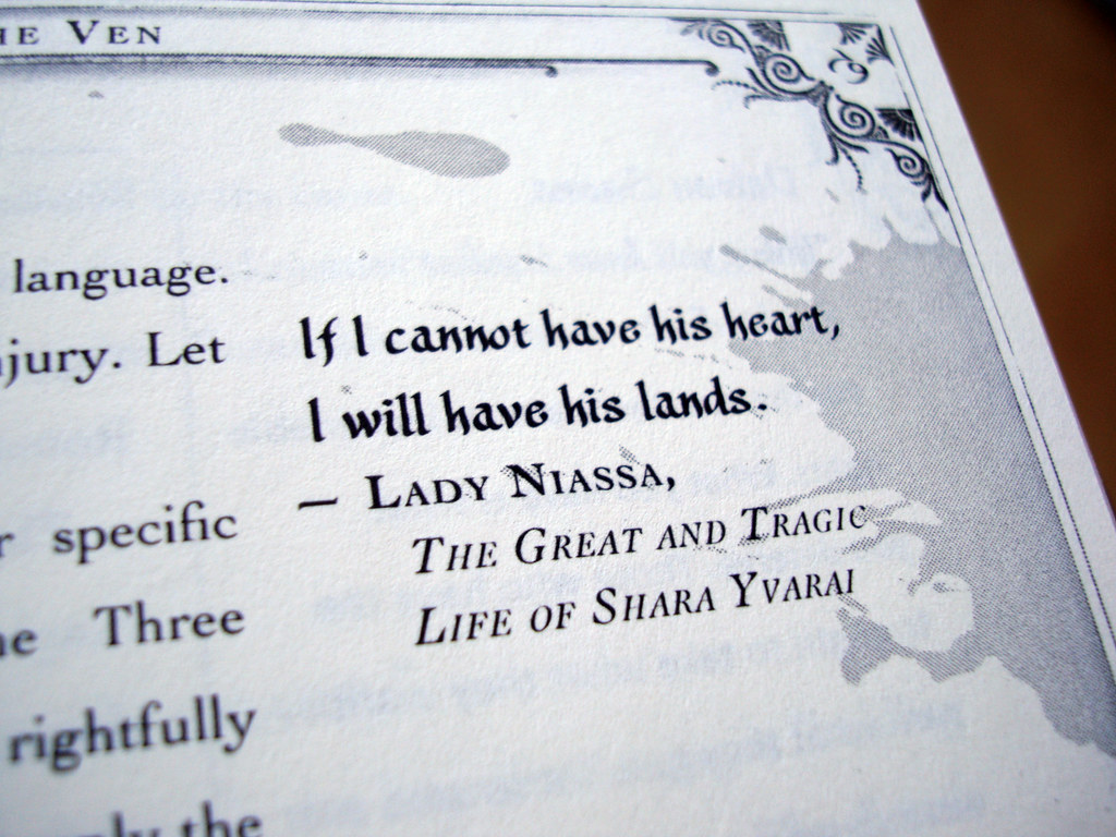
Quotes
John had limited art assets for this project, aside from Storn A. Cook provided illustrations. That being the case, John wrote a bunch of quotes that added a bit of color to the setting. I'd distribute them throughout the book in places where there would normally be a spot illustration. For an added flourish, the quotes would be set against another blood splatter.

Aspects
In the rest of the book, John wrote sidebars that fell into three categories. The first category were Aspects. These are characteristics that can be "tagged," "compelled," or "invoked" in play. To help distinguish each of these actions, I made a family of icons for use as in-line visual aids.
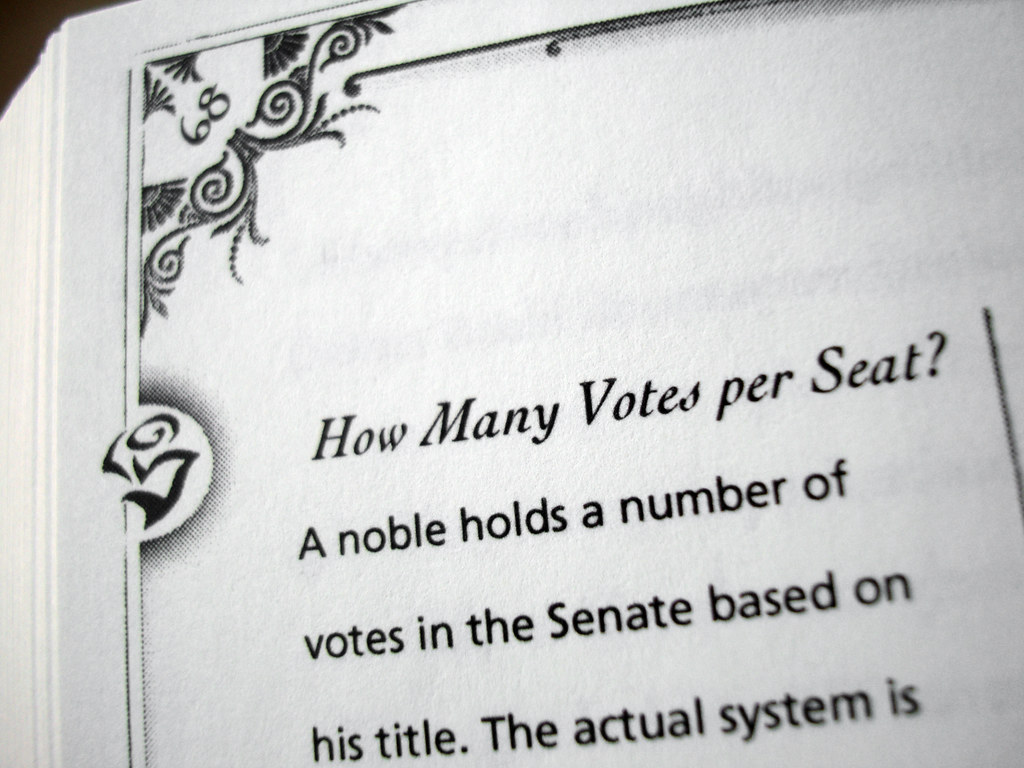
Setting FAQs
John also wrote little FAQs detailing bits of the Ven culture, their history and other matters most relevant to the in-world fiction. These are called out with a stylized rose icon.

Rules FAQs
When a question pertained to the rules of the game itself, I used a proper question mark as the wayfinding icon. The text was also set in a sans serif to further distinguish it from setting material.

Tables
John didn't have many random tables in the book, but when they occurred, I called them out with a dice icon. Page space was limited, so I didn't add any special borders to tables and charts.
» More about Houses of the Blooded
» More about Storn A. Cook
» Previously: Case Study: Freemarket Icons


That's beautiful work, Daniel. I'm so glad you're doing these case studies!
ReplyDeleteThanks. It's really helpful to go back to these old projects and remind myself why I did what I did. :P
ReplyDeleteVery excellently done. And I too appreciate the case studies. I like learning to appreciate elements my untrained eye may quickly overlook. I really like the blood motif, elegant in its coarseness, set against the arabesque designs. They combine to a very effective aesthetic.
ReplyDeleteGlad you enjoy them! It takes a while to compile all the photos and notes. I should keep better records during the actual project so I can put out case studies more regularly. Until then, I still have a thick backlog of projects to write about.
ReplyDeleteGlad you enjoy them! It takes a while to compile all the photos and notes. I should keep better records during the actual project so I can put out case studies more regularly. Until then, I still have a thick backlog of projects to write about.
ReplyDeleteThat's beautiful work, Daniel. I'm so glad you're doing these case studies!
ReplyDelete