Game Mechanics and Art Direction
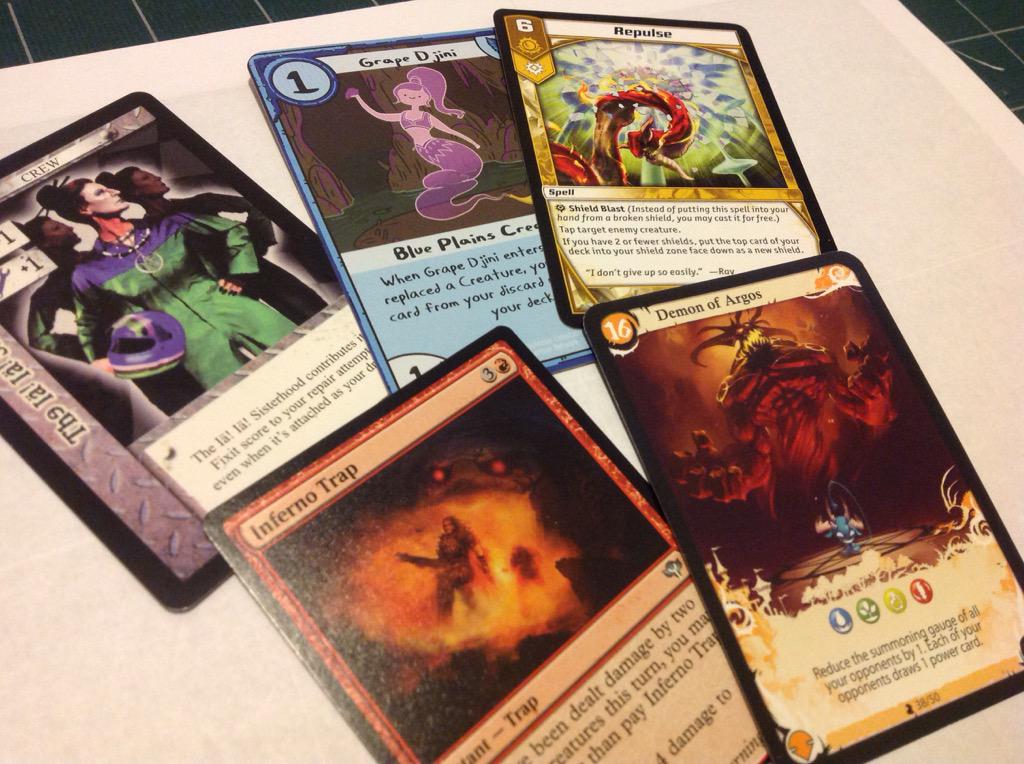
While preparing for A La Kart's long-term development, I played or researched as many "Cards with Words" games as possible. That's CCGs, LCGs, deckbuilders, digital card games, and any tabletop games that happen to have a lot of cards. That research has been as much about graphic design as game design.
One pretty consistent rule of thumb has been that art goes at the top and text at the bottom, perhaps with a cartouche of important info on the top left. I wondered aloud on Twitter why that tradition had become the rule for so many games. Kevin Wilson dropped some wisdom from his years of experience in the field:
@DanielSolis As others thought, players come to associate the text with the card art, which is easier to distinguish at a glance than text.
— Kevin Wilson (@KevinWilson42) March 5, 2015
"Cards with words" games tend reward deeper familiarity with the text, especially if you build your own deck. Once you've memorized the text, then the art and other visual cues become the visual shorthand. In other words...
Card art is a mnemonic device for card text.
That jives with what just read Mark Rosewater's article about how he'd start Magic: the Gathering over from scratch. Apparently in the early days, art directors were too lax about depicting the card's effects accurately in the art. Creatures without "Flying" were shown in the air, and vice versa, which caused some confusion. It revealed the mechanical importance of art direction and its symbiotic relationship with gameplay.
I recommend reading the rest of that Twitter thread for some good info from smart folks.

Comments
Post a Comment