Posts

Zoomies: a Trick-Taking Game for the Mirror Deck

Image
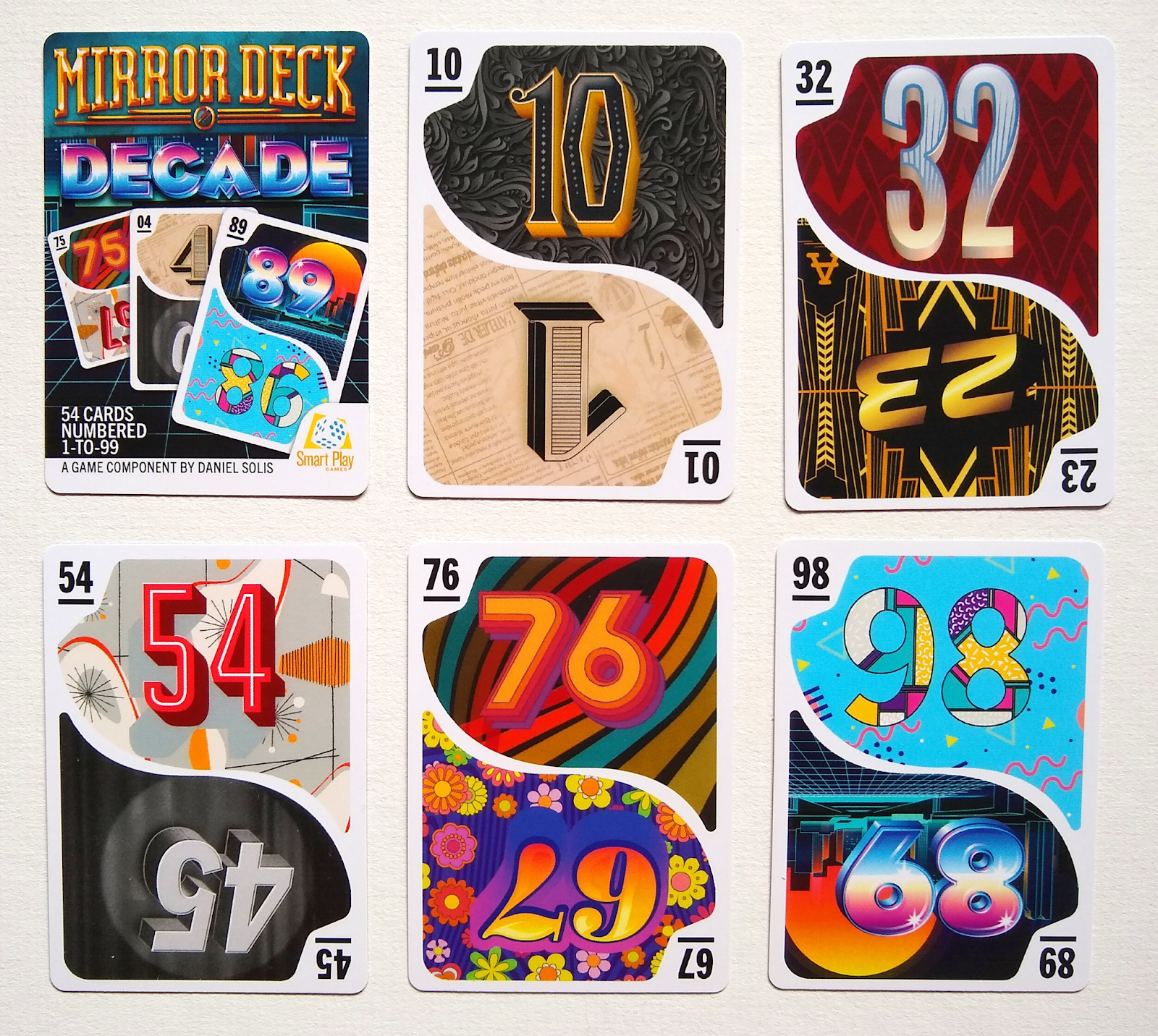
Hi all! Following up my earlier post about analyzing the unique aspects of the Mirror Deck, I promised a trick-taking game using the deck. Here it is! -~-~-~-~-~-~-~-~-~-~- Zoomies A trick-taking game for the Mirror Deck. You are cats wildly climbing up and down. The player with the most points gets in trouble for breaking the furniture. The player with second-most points at the end of the game wins. Overview Players: 4 Time: 15 Min Age: 8+ About the Mirror Deck This deck is 54 numbered cards. Each card is numbered 1 through 99, but each two digit number can be reversed. For example, the 53 card is also the 35 card. All the single-digits’ counterparts are multiplied by 10. For example, the 01 card is also the 10 card. Setting Up the Game Shuffle the deck and set it to the side of the play area. Remove 2 cards from the deck. They will not be used in this game. Setting Up Each Round The game is played over three rounds. At the start of each round, deal cards from the deck to each playe...

Analyzing the Mirror Deck for Game Design

Image
It's been a few years since I created the Mirror Deck and posted it on DriveThruCards . As a reminder, it's a deck of cards numbered 1 through 99, where each number can have its digits transposed, so the deck is only 54 cards. I asked some advice from other game designers recently on where to take the deck next. James Ernest was especially helpful, recommending that I look for any rarities or natural "sets" in the deck that would lend themselves to game mechanisms.  I'm looking at how I can make a two-player trick-taking game out of the Mirror Deck. Triangular Numbers There are 13 triangular numbers in the deck's range, which I could mark with a triangle "suit" icon. 1, 3, 6, 10, 15, 21, 28, 36, 45, 55, 66, 78, 91 Perfect Squares There are 9 numbers in the deck's range, which I could mark with a square "suit" icon.  1, 4, 9, 16, 25, 36, 49, 64, 81 Primes There are 25 prime numbers in the deck's range, which I could mark with a ...

Designing Punch Out Components for Board Games

Image
These components go by many names in the industry — Chipboard, Punchout, Punch Sheets, or Cardboard — but I typically just say “punch board” out of habit. They all refer to thick cardboard pressed between two glossy color laminate sheets on either side. A factory can create custom dies that perforate these sheets into different patterns, then the resulting tokens can be punched out of the sheet. (Packaging and shipping tokens still connected to a sheet protects them in transit until they’re purchased.) Before getting too far along in your design process, consult with your factory representative to confirm they are able to achieve your requests. They’ll offer solutions that best suit your needs at a budget you’re able to sustain. They will also explain how they prefer to have their files delivered.  Assume all punch board components require designated bleed, trim, and safe zones just like a card design. However, the thickness of the sheet determines how strict those margins need to ...

A Visit to Sid Sackson's Archives

Image
After legendary designer Sid Sackson passed, the Strong Museum of Play became the home of his personal papers. This collection includes correspondences, journals, prototypes, sketches, and a bunch more ephemera from his long career. His diaries alone spanned 35 years and were intricately indexed. It will take years to transcribe and digitize them all, but the early parts of his career are up on the Sid Sackson Portal here:  https://sacksonportal.museumofplay.org/s/sackson-portal/page/welcome A year after the portal's launch, Julia Novakovic posted an update on the project's ongoing road map for future transcription and public display:  https://www.museumofplay.org/blog/the-sid-sackson-portal-one-year-later/ But before the portal went online, the only way to see any of these papers was to go personally to the Strong Museum and schedule a visit with the curator. (Many thanks to Julia for giving a rando like me access to these artifacts!) My wife and I paid a visit to Rochester t...

Translating Game Text to Language-Neutral Diagrams

Image
Good news! I've submitted the final draft of my book "Graphic Design for Board Games" to the publisher! Of course that now leaves a void in my schedule for some other long-term project. I'm not yet certain what that would be, so for now I'll continue sharing early drafts and previews of what I've written for the book. The following section comes from the chapter on designing language-neutral diagrams. In this sub-section, I discuss the practical process of diagramming each part of a game action into glyphs and icons.

Three Principles of Card Design: Visibility, Hierarchy, Brevity

Image
This is an excerpt from the rough draft of my book  Graphic Design for Board Games.  If you want early sneak peeks at the rest of the draft, including editorial comments and discussion, head over to my patreon ! 

What to do with Trickster, hmmm...

Image
I've got the rights to Trickster back in my hands! I'm considering where its future may lead.  Trickster was my first attempt at really pushing print-on-demand as a primary distributor. It was an ambitious plan back in 2015. In those days, it was a series of individual small-deck card games. The deck sizes were optimized for best margins and ease of shipping from POD. Each deck was standalone, but could be shuffled together. The core rules were the same for all of the games, but the cards in each deck had unique abilities. (I would attempt this again with the " I Can't Even " series and with the  Plume  decks.)  After releasing the fourth deck, Trickster got picked up by a publisher as a  big box edition on Kickstarter , with a new look at revised theme. Unfortunately it never really caught on in retail. I think it's really better for a small indie channel like DriveThru. I'd been waiting for the retail inventory to run low before promoting the classic de...

Rocket Broker - Worker Placement Area Control Roll-and-Write

Image
(This is a rough sketch of a game from 2017, when dice placement and roll-and-writes were gaining more popularity. I was in a phase where I was just merging as many different ingredients together to see if they'd stick.  You can see some of these ideas in Pencil Park.) You’re trying to get your payloads onto rockets and into orbit. Rocket space ain’t cheap and neither is the fuel. You have to invest wisely if you want to launch!  Setup The game comes with a deck of rocket cards. Shuffle a number of cards based on player count. (Designer note: I never determined a number since this prototype never got tested.) Lay out six random rocket cards onto each of the launchpad spaces. Each rocket card has a space agency that is sponsoring its launch, like NASA, or JAXA. Each rocket has a different arrangement of spaces representing its cargo capacity. The oval below each rocket card space is its fuel, which will be needed for the rocket to launch at all.  Start of Round At the star...

Ludology discusses imposter syndrome

It's the annual recap episode of the Ludology podcast. Important notes on imposter syndrome here. Host Erica Bouyouris is the designer of "Dumb Ways To Die," the best-selling new card game of the year. That should be a huge achievement for any game designer. Unfortunately, that doesn't align with BoardGameGeek buzz or lead to big awards, so she's had to come to terms with that as she continues in her career. Good discussion on feedback, mental health, and managing your well-being as a game designer. https://ludology.libsyn.com/ludology-315-happy-2024

2023 Book Review

Image
Here are all the books I've read and reviewed over the past year. As is typical of my lifestyle, I take in more audiobooks than physical books. I'm not a purist about that sort of thing. The one hitch is that I've already burned through a LOT of the audiobooks from the library that had my interest. It's forced me to branch out to other genres, so you'll see some more non-fiction and a couple of mysteries here. Plus one or two books I'm categorizing as Fantasy, though there are no swords and sorcery in the mix. There is one very specific element that kept popping up in the sci-fi I read this year: A distant-future community of humans has their Earthly origins kept secret by a manufactured religious authority. The Interdependency Trilogy features a theocratic government put in place to manage an interplanetary alliance of traders and producers. The Safehold series backstory, human survivors of an alien purge get their minds erased and rewritten to avoid any new in...

Five Themes for Set Collection in Board Game Design

Image
I often rely on set collection for my early prototypes. It's such a simple, satisfying framework to motivate players and give clear goals. The problem is how often set collection becomes a rote, emotionless task list to complete. The theme of the set collection is what set makes it more appealing to new players. An evocative theme suggests secondary mechanisms that help fill out the rest of the game. Here are a few themes I've used or seen over the years. Recipes and Shopping Lists Welcome to Stabbed! Impress the chefs, follow the recipes, and you won't be stabbed! This is by far the most common usage of set collection. Players are tasked with collecting certain amounts or combinations of resources. Then they're rewarded with a certain number of points. That straightforward transactional structure is certainly useful when the rest of the game is rather complex, but it doesn't necessarily suggest fun secondary mechanisms. I got around this in Junk Orbit by making th...

Artist Advice: Early in my career, should I focus on building my portfolio or taking on small jobs?

Image
  This is extremely important: What you draw today is what you'll be hired for tomorrow. If you draw spaceships, you'll show up on searches for spaceships. If you draw dragons, you'll be sorted with the dragons. If you don't want to draw spaceships or dragons, don't post them in your portfolio. As an art director, I have to search through hundreds of portfolios for each project, looking for the right potential candidates. If I don't see what I need in your portfolio, you don't even appear in that initial search, let alone get further consideration.  If you're in a financial position to just work on your portfolio so you can build up your skills, that's totally valid. Just make sure you're posting consistently and that your best work is visible first. You can also delete older work that doesn't show your current skill level. (I see a lot of portfolios with years-old freshman-level work that never got cleared out.) To get paid will building you...

Artist Advice: How do I pick freelance jobs early in my career? Should I argue for higher pay or take what I can get?

Image
First of all, never work (for someone else) for free! I'll break those four ideas down below, but just remember that only you can determine what your time is worth. You can always go lower, but it's hard to go higher. I recommend starting high. Never accept the feeling of being underpaid for your time and skill. You'll be surprised how quickly you can fall out of love with art. That said, both of these questions require an honest assessment of your skills, availability, the client's personality, and your enthusiasm in a particular project. Skills : Browse "open for commissions" tags on social media and look for artists with a similar style and skill level as yourself.  Try  to do this with a healthy perspective. This isn't an attempt to make yourself feel bad or good. Think of it as co-workers organizing for better pay. You're just assessing a fair pay rate. Even if all other skills are equal, you might still opt to charge more for the same project tha...

7 and 1: Avoiding Confusion

Image
  Photo of two tokens. One with a one and one with a seven but they look almost identical making it hard to differentiate. ( Source ) Some typefaces don’t have enough distinguishing features between their 7 and 1. The usual culprits are sans serif, modernist, or futuristic fonts that have removed so many distinctive features of their characters that they become indiscernible from each other. You may also run into this problem with italicized numerals, where a slanted 1 could be confused for the angle of a 7. 7 should have an exaggerated angle, with a wide stance that significantly extends its top bar. It may also be handy to have a small crossbar across the midsection, though this is not a common attribute. Avoid any 7s that have a serif base, since that is more common for a 1 and may lead to further ambiguity. 1 is should be upright, to contrast the 7's lean. You can look for an even MORE simplified 1 that is so abstract that it just becomes a skinny vertical line. Just be careful...

"Snappy Dresser" Card Template

Image
As a little weekend hobby project, I was thinking about how some of the concepts and visual language of Marvel SNAP would translate into a printed card.  Very quickly, this spun out into its own concept. I imagined the cost and strength would both have to be locked to the top left for ease of reference. I minimized the cost icon to be less prominent since you'd rarely have to look at it while it's in play. The basic, ongoing, and reveal abilities ought to have distinct backgrounds so you could quickly scan the board for triggers.  The artwork here comes from "Aguila Negra" (Black Eagle) issue #100, a Portuguese language comic from 1966 that is now in public domain. I loved that this guy wearing a full knight costume would don a disguise OVER his costume, including sunglasses over his mask and a fedora over his helmet! Quite a snappy dresser indeed! You can download this Photoshop file at the Patreon post linked below.  » https://www.patreon.com/posts/82651355 This inc...

Troubleshooting: How to fix "Remove Blank Lines for Empty Fields" in InDesign Data Merge

Image
I'm working on a card design that has multiple variables within the same text field. Each variable is its own paragraph with its own Paragraph Style. It's rare that every card has content for each variable ABC though. Usually it's a mix, like AC, AB, or BC. The issue is that when you delete empty lines, sometimes the remaining paragraph gets re-assigned the deleted paragraph's style. Compound this over a whole document and you can see why it's a pain in the butt. Here's a video explaining the situation: Here's my solution: To reliably remove blank lines from a merged document, first do NOT activate "Remove Blank Lines for Empty Fields" in your Content Placement Options. It's often too buggy to be reliable, except in the most simple cases where all of the paragraphs have the same style anyway. Then Create Merged Document as you normally would. The resulting document will have a lot of blank lines because of the empty fields. Here's what you ...