Card Design Inspiration from Package Design

My game inspiration comes from all sorts of stuff, but most often it comes from stumbling upon a cool image, illustration style, or graphic design. Package design in particular has a lot of similarities to card design. You have to maintain a consistent brand aesthetic across multiple instances, but still create enough diversity within that line to distinguish each individual product.
That's very similar to designing a deck of cards, making sure there are some consistent elements like typography, composition, contrast, art style, etc. But at the same time, each card must be different enough to avoid confusion in actual play. Much like card design, a good package design must double-code to make those differences clear to people with different visual abilities. Can the package/card be distinguished by color-blind buyers/players , for example.
It's all about Iterative Visuals. Start with one baseline, change one or two things, and always only change those one or two things for each iteration. Take a look at some of these packages and imagine what card game you could make featuring these design schemes. Above is one of my favorites: The Newman's Own organic mint line, designed by Terri Gosse and Kelly Pickering.
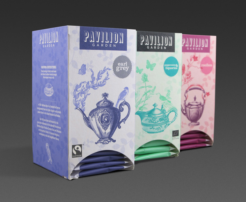
Designer: Pearlfisher / Source: Lovely Package
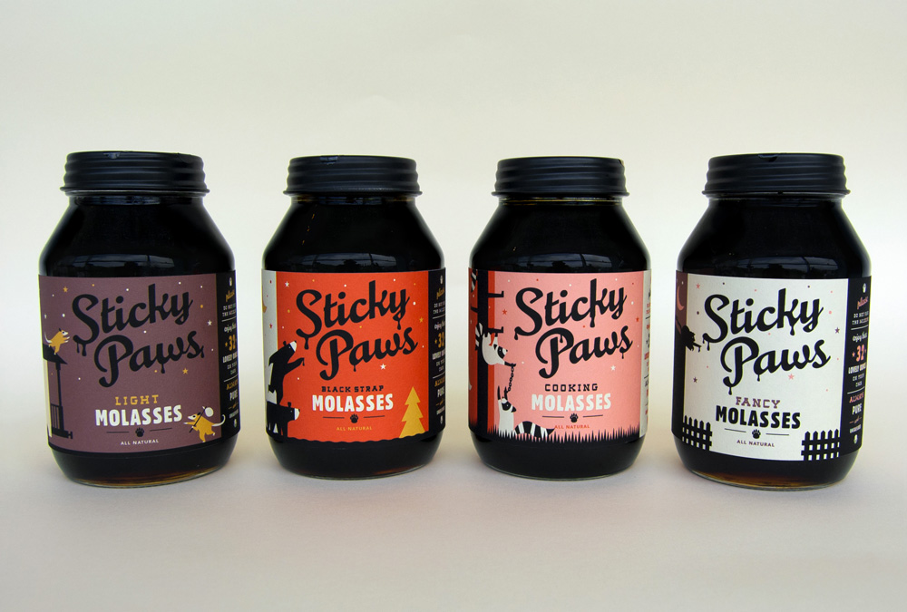
Designer: Caleb Heisey Design / Source: Lovely Package
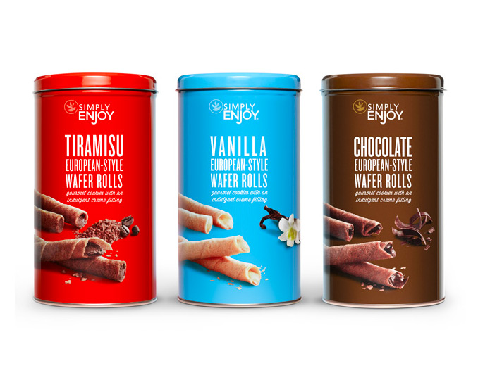
Designer: One Darnley Road / Source: Lovely Package


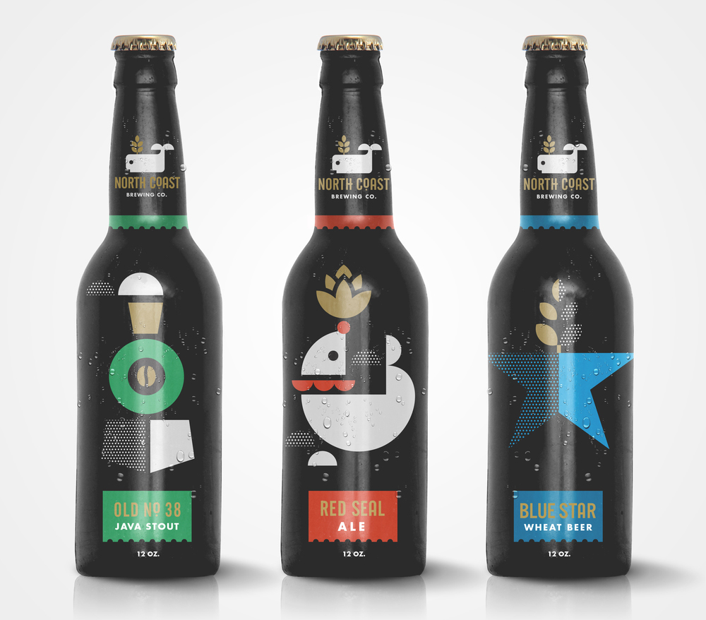
Designer: Big Fish / Source: The Dieline


Comments
Post a Comment