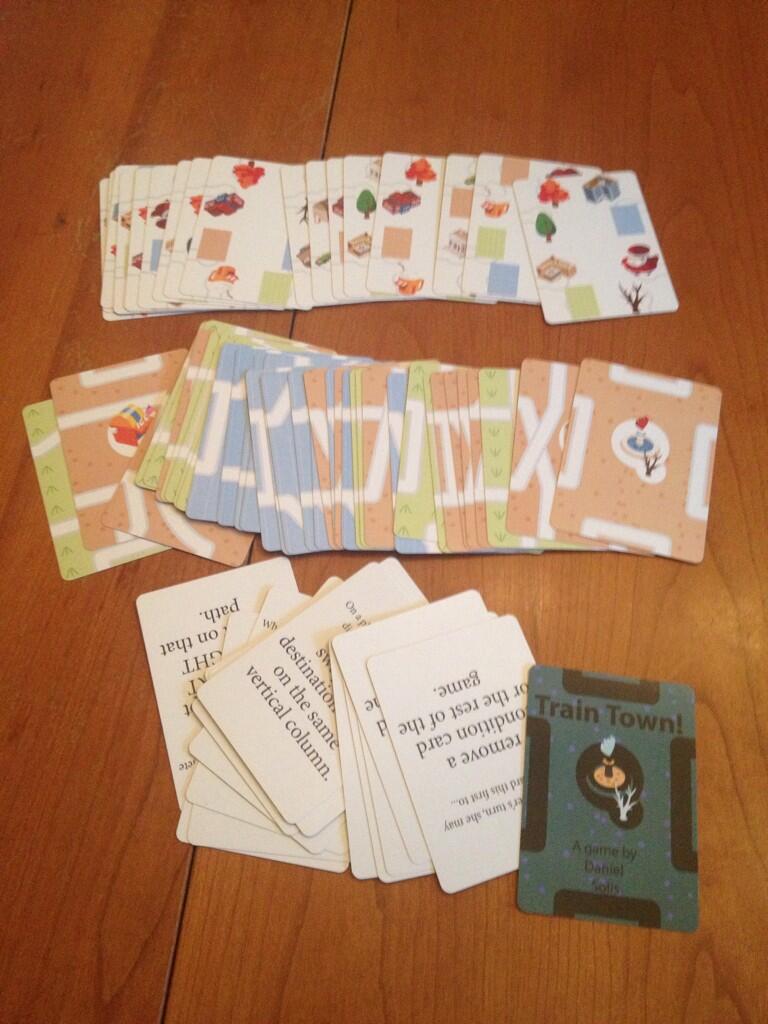
Train Town Prototype E made it to finals! (But didn't win.)
Train Town has had a short, odd little history. I sketched it out at the last minute, untested, and submitted a print-and-play PDF to a Korean Board Game contest on a whim. (In the interim, Julian Murdoch got ambitious and even had an Artscow prototype printed up for his own use, as you can see above.) Against all odds, it made it through to finals! I shipped over Prototype E for the final round of judging. Unfortunately, it didn't make the top 3.
Robin Lees also tested Prototype E with his family as a two-player and three-player game. It seems the biggest challenge of the game was analysis paralysis. Even with a restricted 2x2 grid, players would feel compelled to calculate every possible location. Also, including the Action cards as an endgame condition is a problem since it can cut a 3-player game to down to as little as 3 turns per player. And on production note, the background terrain was a little hard to distinguish for the color-blind. On the bright side, scores are still pretty even despite that short play time. Perhaps too close, I tend to make games that are too evenly balanced, so I may need to address that.
I suspect the next steps of development will be simplifying some of the possible route cards and perhaps even retheming the game to make it a bit more sensical. I've been considering a tour theme, sort of like Family Vacation or Tokaido. It will be relatively easy for me to make an abstracted city map background sort of like this, but with more detail and more clear, wide thoroughfares to indicate the routes.
Or if I'm lucky, hire a map artist to hand-draw something:
Either way, I have two options I'm considering for the next steps of development.
Option 1: Fewer Cards
Cut the card deck down to 54 cards by adding action icons to each route card and removing the separate action deck entirely. Now you may play two cards on your turn, one as an action and one as a route. The only reason I'm thinking about this option is because 54 cards is a nice, easily produced quantity.
Option 2: More Cards
The center of each card would still feature a combination of three unique features, but I think I'll add a supply of "Photo" cards for each feature. When you make a "scoring" path, instead of just scoring points, you collect the corresponding photo desired by the tourists at either end of that path. Each photo is worth 1 point, naturally, but having the most of a photo earns you extra bonus points.
What to do... what to do... Boy, I'm getting analysis paralysis just thinking about where to take this game next.

Comments
Post a Comment