Coloring the Promotional Art for Do: Pilgrims of the Flying Temple

[Click to embiggen!] We're gearing up a Kickstarter to fund the production of Do: Pilgrims of the Flying Temple. That means we need a promotional image. Something to use as a poster frame for the Kickstarter video, shared along side press releases, and, most importantly, something to entice pledgers' interest. Do was once called the fanfic game for a Nickelodeon cartoon that never existed. I figured I'd make this look like a promotional image for that cartoon, using cel-shading coloring and a slightly anime aesthetic.
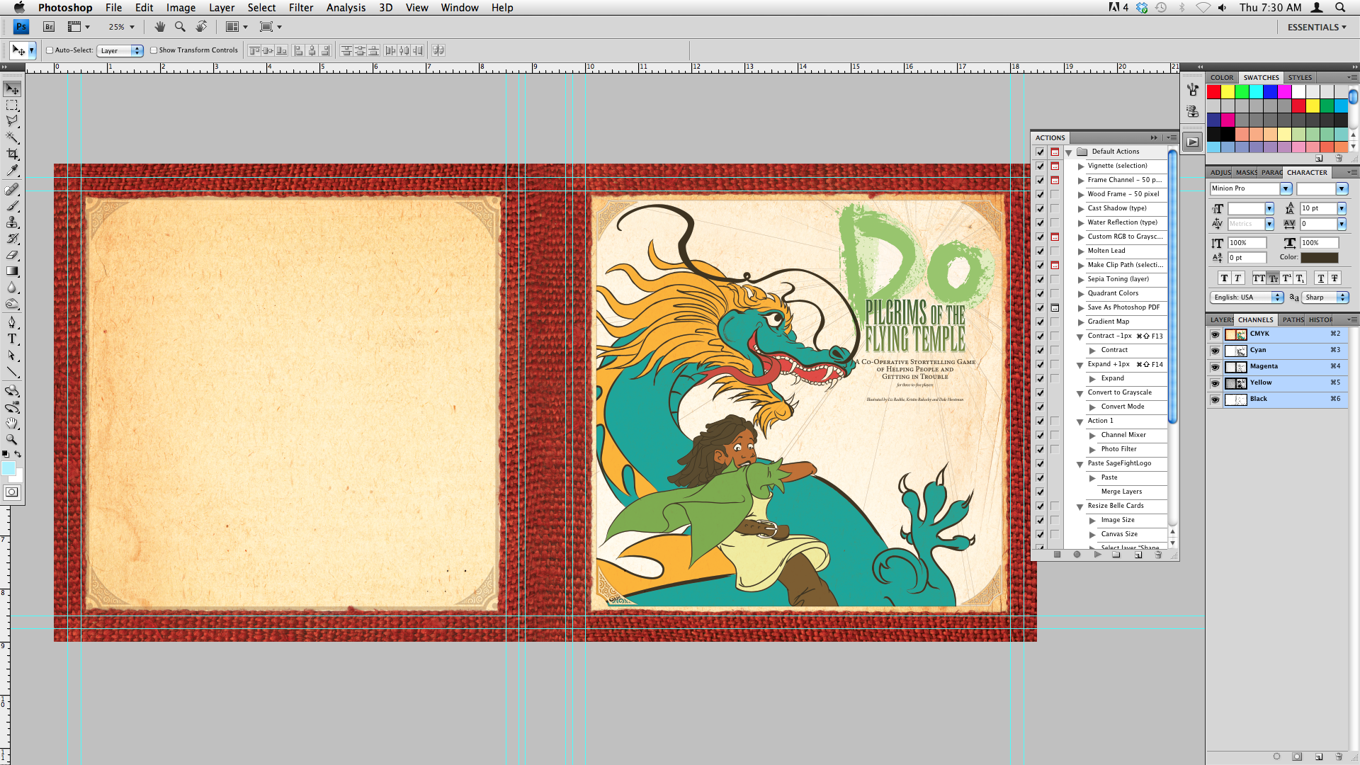
I don't know much if anything about coloring art. So, I studied stills from Disney movies, Avatar: the Last Airbender and promotional art for the MMORPG Dofus. I practiced a bit with the Belle of the Ball illustrations, but I knew actually coloring the dragon and rider was a whole other realm. I started by getting the basic elements settled. I knew I wanted the title on the top-right, a red fabric border, and a paper texture in the background.

I started with the dragonrider. Figuring out her palette was the most difficult part of the process, actually. The dragon would have a strong cool blue hue, so she needed to stand off from him. That meant she needed browns, oranges, and earthtones. I also added greenish accents in the shadows, as if the dragon's scales are shining across the back of her head.
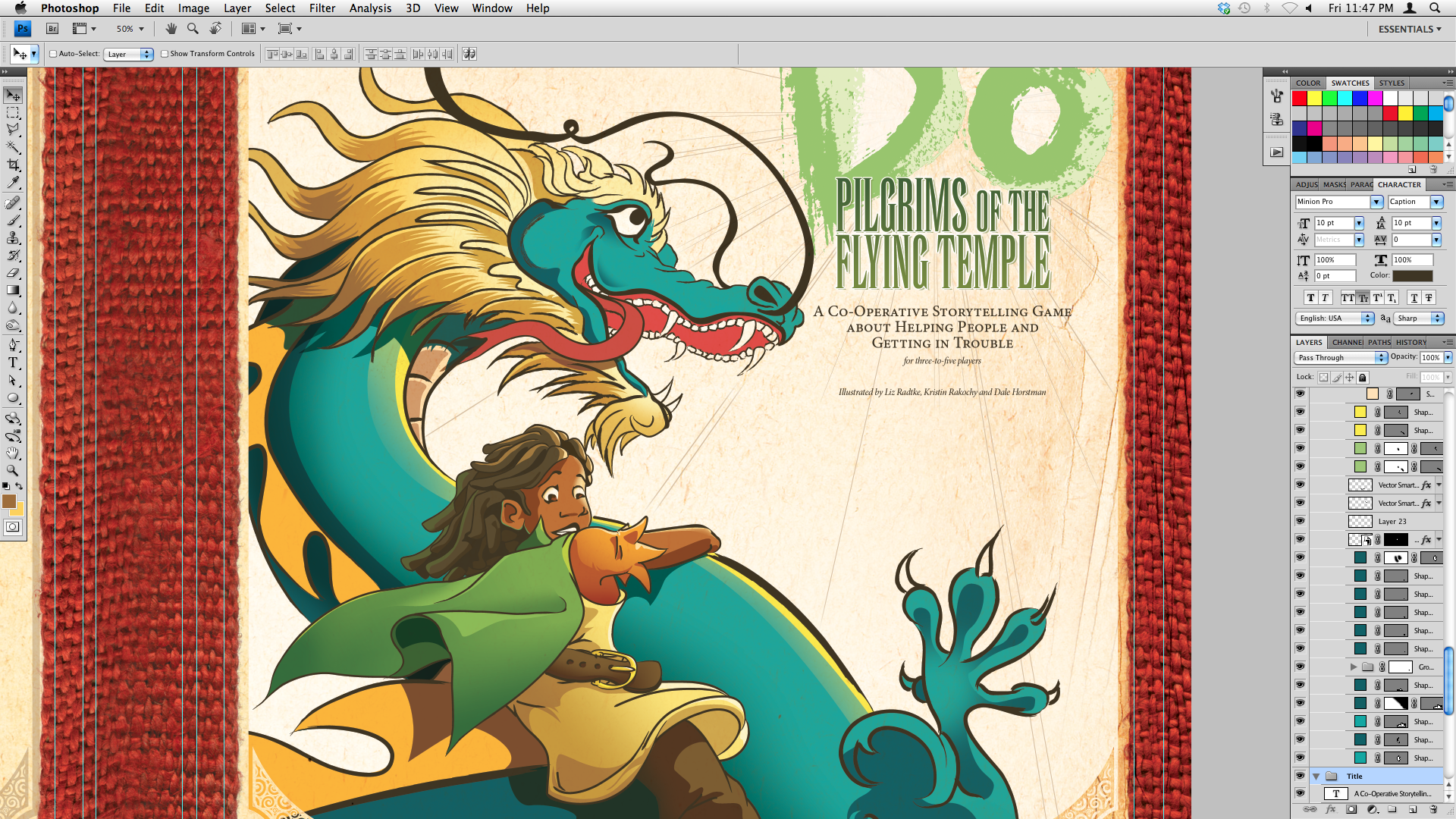
If those dreadlocks were a challenge, the dragon's mane was monumental. Oof. It took a while before I figured out how to best suggest that this was a furry, lustrous mane and not just rows of very large scales. Again, looking at animation cels was very valuable here. You can suggest hair and fur with simple triangular shapes. Layering darks and lights suggests movement.
In the final image at the top of this post, you can see the dragon's pupil is now dark green, his scales are ever-so-slightly suggested in the shadows and highlights, and he's now in front of the red border. All that was left to do was refine the title graphic and add credits. Now we have a solid promotional image to tie into the Kickstarter and send out with any press releases!
» Original line art by Liz Radtke
» Rules for Do: Pilgrims of the Flying Temple


Man, I LOVE that the border is an actual weave instead of an illustration of one. Lends it a really 3-dimensional feel at a glance without intruding on the main image focus.
ReplyDeleteThanks! You can see in some of the progress screenshots that the dragon used to be behind the red border. At the last second, I deleted the mask on that layer group and saw how nicely that teal popped off the deep red texture. Happy accident. :)
ReplyDeleteDaniel, it looks splendid. I'm putting it on my wish-list :-)
ReplyDeleteMaciej
Daniel, it looks splendid. I'm putting it on my wish-list :-)
ReplyDeleteMaciej