Case Study: Freemarket Icons and Logos
Case Study At a Glance
» Project: Create icon set for a new sci-fi RPG.
» Researched euro-futurist, modernist and post-modernist media.
» Collaborated long-distance, on-budget with regular updates.
» Produced a suite of vector icons.
» Freemarket sold out of all stock in its debut at GenCon.
History
Jared Sorensen and I first worked together on the layout for the new version of his game Lacuna. A few years ago, he and his partner-in-crime Luke Crane were teasing "Project Donut." A secret new game in development, with little public branding besides enigmatic blog posts and images. Jared and Luke are no johnny-come-latelies to the game business, publishing over a dozen successful indie games between the two of them.
 |
| Jared and Luke provided these icons as examples of what they had in mind. |
Jared and Luke asked me to create a suite of icons for the project. I was eager to get started just to learn more about the game itself. The game was Freemarket, set in an overcrowded, post-scarcity, post-human space colony where social collateral is the common currency. Jared and Luke would be publish it as a full-color boxed set, with counter chips, instruction book and assorted cards. Sorencrane needed icons for wayfinding, infographics and as general spot illustrations.
Specs
• 2” Circle
• Avoid Identifiable Humans
• Avoid Body Parts
• Avoid Letters/Numbers
• Avoid Gears
Jared and Luke also requested a few additional constraints on the iconography, which you can see on the right. I'm always up for working within and around creative constraints.• Avoid Identifiable Humans
• Avoid Body Parts
• Avoid Letters/Numbers
• Avoid Gears
Research
 |
| Research is fun! |
Execution
 | |
| Download Freemarket icon PDF |
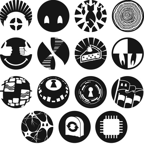 |
| The complete suite of Freemarket icons. |
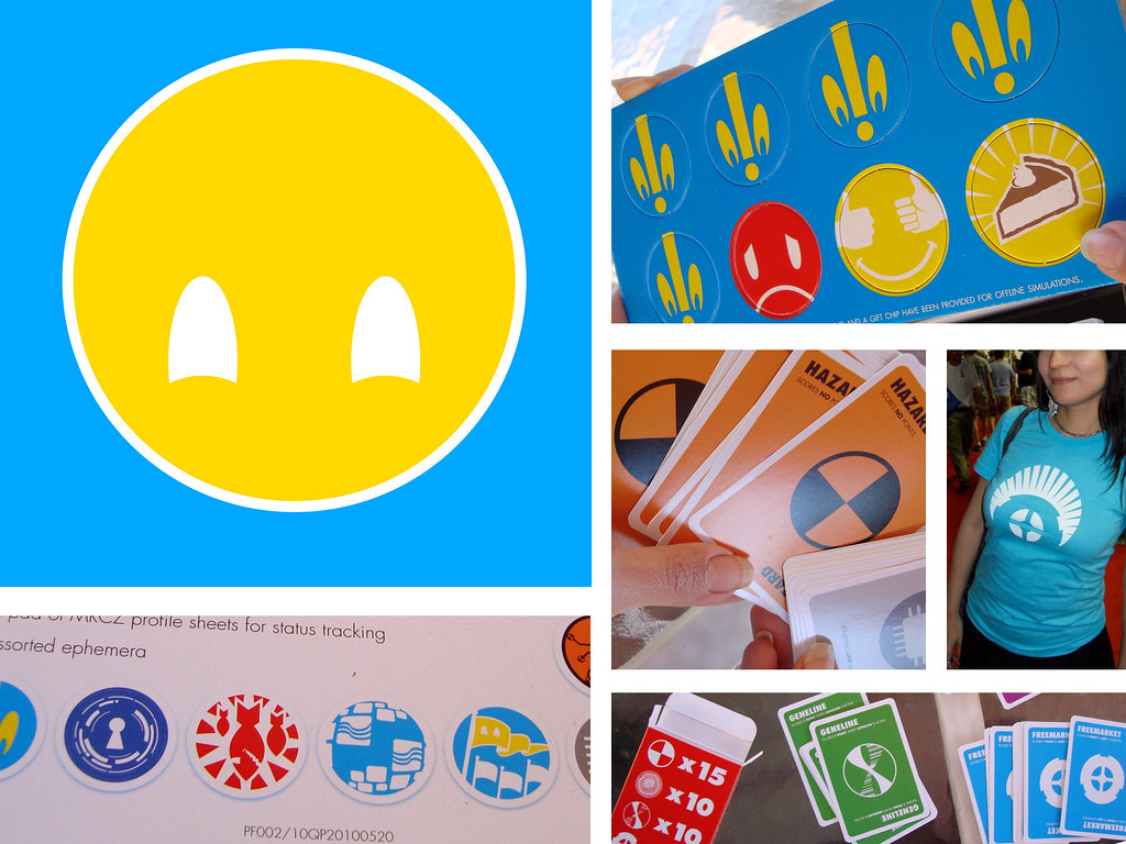
You can see how the icons were implemented on the packaging and other game materials in the photos below. (Thanks to John Stavropoulos and Terry Hope Romero for the unboxing pictures.)


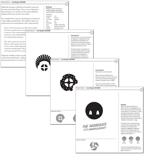
Case In Point: The Aggregate
In Freemarket, the space station's residents are cared for by an artificial intelligence called the Aggregate. It provides sustenance, living space, safety and essential biological needs.


» Photos courtesy of John Stavropoulos and Terry Hope Romero
» Freemarket Unboxing
» More about Freemarket
» More about Logopond


Interesting. Thanks for sharing Daniel :)
ReplyDeleteWow, this is fantastic, Daniel. Keep posting stuff like this - the insight is well worth it.
ReplyDeleteI hope to do more case studies in the future. NExt on the docket, in no particular order:
ReplyDeleteHouses of the Blooded - Cover and Layout
Reign - Cover and Layout (and progress bars)
Wilderness of Mirrors - Cover and Layout
Interesting. Thanks for sharing Daniel :)
ReplyDelete